

Natalie Fedorenko
Web analyst at PROANALYTICS.TEAMCohort Analysis: Definition, Types, and Practical Examples
It’s no secret that sunlight isn’t actually white. It consists of waves of different lengths, and with the help of a prism, it can be split into a colorful spectrum.

Your customers are just the same — they’re not a single “one-color” stream. For example, you might look at last month’s statistics in a standard table and see that X customers brought you Y in revenue. But how many deep, truly actionable insights do you usually get from such tables? I suspect — not that many.
And that’s perfectly natural. You’re looking at the total customer base, which includes both someone who made their very first purchase for 100 UAH and someone who’s been with you for eight years and is buying for the hundredth time. These are completely different audiences, and they deserve different levels of attention.
Cohort analysis is your prism — it takes a solid mass of users and divides it into groups: new customers, those who came through a promotion, users from a particular region. And suddenly you see: each group has its own “color,” its own patterns, its own behavior. This very effect — the ability to reveal hidden differences — is what makes cohort analysis so valuable for business.
The scope of cohort analysis is unlimited, and it can be useful for everyone. In this article, I’ll explain what types of cohorts exist, share examples for SaaS, eCommerce, B2B, and mobile apps, and show what insights you can gain. You’ll also get a chance to try conducting this analysis yourself using test data — there will be a link to an interactive report example.
Here’s the plan for today:
What Is Cohort Analysis
Cohort analysis is a method of grouping customers (cohorts) based on shared characteristics and tracking their behavior over time. Examples of cohorts might include customers who made their first purchase in January, those who first subscribed to a premium plan, or users who registered through an ad campaign. From there, we observe their activity starting from the moment of that first action up to today.
Unlike analyzing all customers as a single whole, this approach allows you to uncover hidden patterns within specific groups. For example, instead of only looking at overall sales or churn levels, a business can split customers into cohorts (say, by the month of registration or first purchase) and notice that some of these cohorts have a significantly higher retention rate than others. This helps reveal successful or problematic aspects unique to particular groups—things that would remain invisible in a general, aggregated analysis.
Such analysis helps you understand customer behavior and answer questions like:
- When and how often do customers return to make repeat purchases?
- How does customer revenue change over time?
- How much profit does an acquired customer bring six months or a year after their first purchase?
- Which customers are the most loyal?
- When do marketing activities pay off—and which campaigns fail to generate profit even over time?
- How does a new feature affect user engagement?
These are just a few examples—we’ll look at more later. For now, let’s highlight the main areas where cohort analysis can be especially useful:
- Understanding the customer lifecycle. Cohorts help you see how the behavior of a specific customer group changes over time and identify at which stage of the lifecycle churn or repeat purchases occur.
- Measuring the effect of changes. Cohort analysis makes it possible to see how a new feature or update affected particular groups of users. This is especially valuable for SaaS companies and mobile apps, where product updates happen regularly.
- Optimizing marketing and offers. By segmenting cohorts based on acquisition channel or product type, you can identify which ad campaigns or product categories bring in loyal, high-value customers—and which ones fail to pay off even in the long run.
Types of Cohorts
The most classic ones are time-based cohorts — groups of people united by when they first engaged with your product or service. But it’s also valuable to analyze customers based on their behavior or characteristics. There isn’t any strict academic or exhaustive classification of cohort types — you can create your own approaches as long as you keep the core logic of cohort analysis: grouping people by a shared characteristic and tracking their actions over time.
Time-Based Cohorts
In these cohorts, customers are grouped by the time of their first meaningful action — the one that matters to you and from which you want to trace further interactions. This could be the day of registration in a service, the first subscription purchase, the first order, the first website visit, reaching a certain level in a game, or the date of the first deal signed. The general principle is simple: groups of people who performed a specific action within a particular time period — for example, a year, quarter, month, or week.
Analyzing cohorts by the time of first action helps assess the quality of acquired leads and identify which periods brought in the most valuable customers. It also helps you see when churn occurs, whether you’ve started attracting more loyal customers compared to previous periods, and when your investments start to pay off.
Behavioral Cohorts
These cohorts group people according to their first action. For example, segmentation can be done by:
- the channel through which a user made their first purchase,
- the subscription plan the user chose after registering,
- the product category of their first purchase,
- the use of a specific feature within a given period,
- the discount size during their first order, and so on.
This approach helps identify behaviors that lead to higher customer value and makes it possible to predict future retention of new customers based on historical data from earlier cohorts.
Segment-Based Cohorts
Unlike the previous type, these cohorts group people by their characteristics that remain constant or change very rarely. These could be any customer attributes, such as their country, acquisition method (for instance, whether they had a demo call), demographics, income level, or customer type (B2B, B2C), and so on.
This approach helps identify which customer types require more attention due to lower long-term retention, and which ones are the most loyal. It’s particularly useful for building targeted acquisition strategies in marketing campaigns.
Each of these cohort types provides a different slice of information. For example: time-based cohorts help reveal seasonal trends — whether the time of acquisition affects the long-term customer value; behavioral cohorts show which user actions are associated with better engagement; and segment-based cohorts by client type show how the efficiency of working with different client groups varies.
The best approach is not to limit yourself to one type but to combine them to obtain more precise and specific insights instead of an overly broad picture in which patterns are hard to trace.
At the same time, do not overdo segmentation. Otherwise, the groups will become too small, and you risk making hasty conclusions based on data that lack significance.
Practical examples for business
The theory part is over. Now let’s move on to something more interesting — let’s look at concrete examples of how cohort analysis can be applied to specific business tasks.
We’ll go through examples for four directions: SaaS, E-commerce, B2B, and Mobile Apps. For better visualization, I’ve prepared an interactive report:
It contains examples for SaaS and E-commerce. These will be more than enough to understand the key principles, and later you’ll easily be able to adapt these approaches to your own specific tasks.
SaaS
For SaaS, cohort analysis plays a crucial role in analytics. It helps improve the most important metric for this type of business — retention, whose level and potential bottlenecks cannot be seen in any other type of report.
In the example below, we group users by the month of their first payment and track how long they continue using our service. The subsequent periods are traditionally divided into 30-day intervals. Thus, the zero cohort includes all users who made their first payment in the specific month shown in the report rows. The first cohort represents users who used the service between days 30 and 59 after the first payment. The second cohort includes those who used the service between days 60 and 89 after the first payment, and so on.
However, while 30 days is the classic approach, it’s just one of the options. You can also group by weeks, splitting the following period into 7-day intervals instead of 30. There’s also a third option if you have relatively little data — to group quarterly and look at 90-day cohorts. In addition, there’s a separate type based on calendar months, which we’ll look at later.
For simplicity, I’ll refer not to the cohort’s ordinal number but to the “months after the first payment.” That is, instead of saying “the third cohort period,” I’ll say “three months after the first payment.”
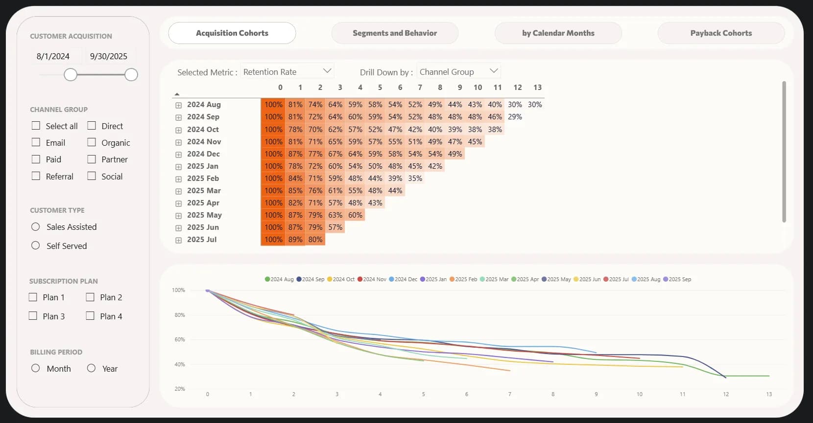
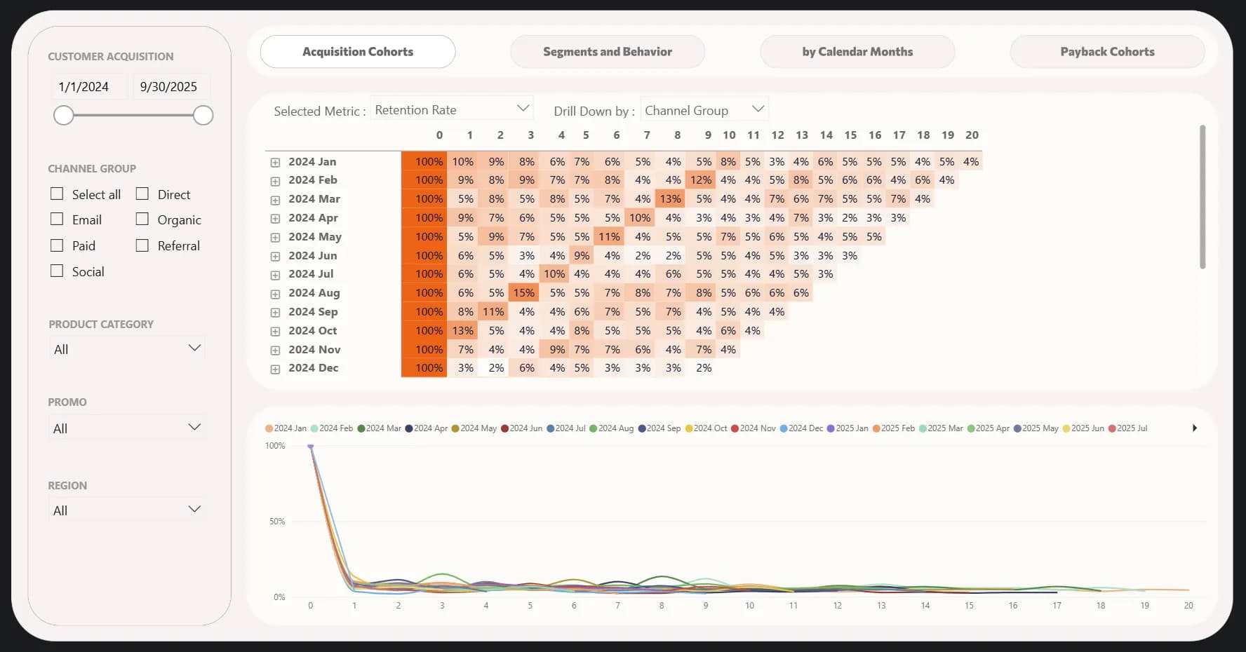
After reviewing a classic cohort retention analysis for the past 14 months, we can note the following:
- Initial retention (month 1): almost all cohorts show a consistently high level — 78–89%. This is quite a good result, as many SaaS products experience a much sharper drop after the first month.
- Further dynamics: after 2–3 months, there’s a noticeable decline — retention often drops to 60–70%, and after 6–7 months it decreases to 40–50% or lower.
- Users acquired in December tend to stay with us more often: they have the highest retention rate in the third and sixth months. Their share remains strong even now — 49% stayed with us into the ninth month. Among the stronger cohorts, we can also note those from September and November — nearly half of the users acquired during that period stayed with us throughout the year. Having identified these strong cohorts, we should investigate what made them different — channels, offers, customer segments — and, where possible, scale those successful approaches.
- We can also identify weaker cohorts, including October, February, and April. Their retention, starting from the third month, is among the lowest and continues to decline further. These cohorts clearly indicate that our acquisition strategy during those months was the least effective.
- If we look at the May, June, and July cohorts, we can see that retention has improved — 87–89% of users stay with us after the first month, which is higher than in previous periods. The second month also shows a strong result — around 79–80%. However, the May and June cohorts suggest that we attracted users whose long-term loyalty is not particularly high — retention in the third month drops to 57–63%, which is no better than average. It’s worth monitoring closely whether our recent acquisition activities are bringing in more loyal customers or if the problem persists — across all cohorts we see a noticeable dip in the third month, which may signal that after an initial burst of interest, users ultimately don’t perceive enough value in the product.
This is just a high-level analysis, and we already have several ideas worth investigating that could lead us to valuable insights. However, it’s highly recommended not to stop at this level but to dig deeper into the data. For example, retention is significantly influenced by annual subscriptions, and it’s better to separate annual and monthly plans during analysis. When filtering only annual subscriptions, we see very high retention throughout the year, which is unsurprising — but after one year, there’s a sharp decline. At the same time, we notice a positive trend — previously, about 40% of users from early 2024 cohorts stayed with us after a year. Now, the July and August cohorts of that same year show that two-thirds of those users remain with us after a year. This means that during July and August we successfully implemented effective retention actions targeting those whose annual subscriptions were about to renew. However, something went wrong in September — we see only 36% of users staying with us after one year.
I recommend opening this report yourself, if you haven’t yet, and exploring different aspects of the data to find insights on your own — I can’t possibly describe all of them within a single article.
Above the table, you can select different metrics:
- Customers – the number of users.
- Retention Rate – the percentage of users who remain with us.
- MRR – monthly recurring revenue. You can read more about SaaS metrics in one of my previous articles.
- MRR Retention – revenue retention: how much MRR we continue to receive over time from users who stay with us.
- MRR Cumulative – cumulative monthly recurring revenue, calculated by accumulation from month to month.
- ARPU – the average revenue we receive from one user after a specific period since acquisition.
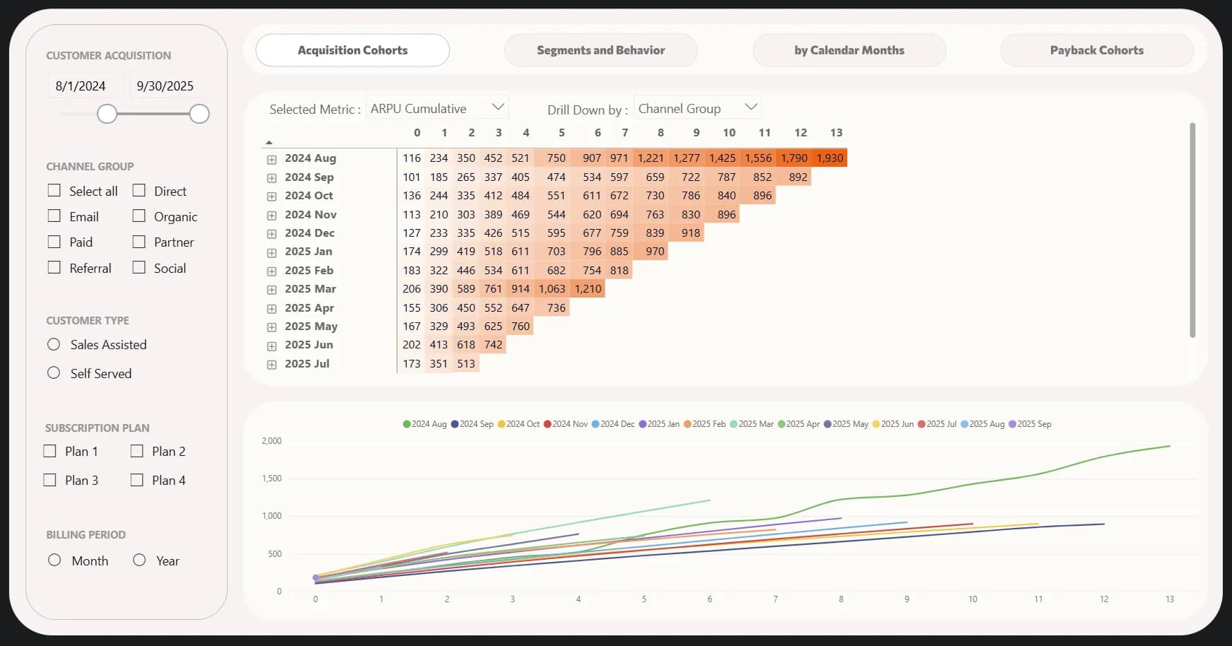
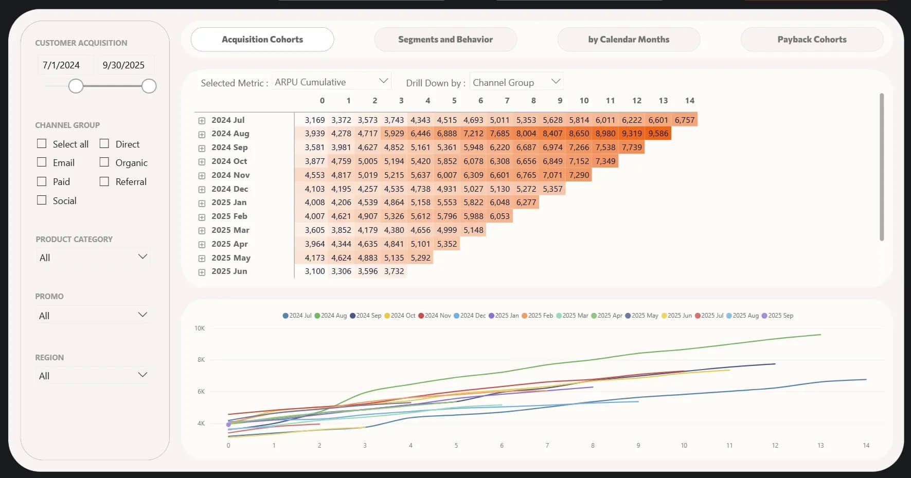
- ARPU Cumulative – this can be seen as the “actual LTV”: cumulative revenue per user from acquisition to date.
The last metric reveals another important insight that we didn’t notice earlier: the March cohorts brought us the highest revenue per user — $1,210. Another strong cohort was August 2024, which ranked second in revenue per user by the fifth month after acquisition.
Thus, while retention is one of the most classic examples of cohort analysis, the truly critical indicator is the amount of revenue we continue to receive from the users who stay with us.
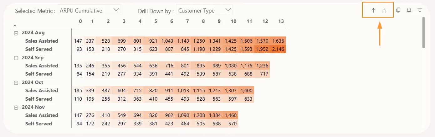
An additional tip is user segmentation. In this same report, you can select the following breakdowns:
- Channel Group – the group of traffic channels that brought the users.
- Customer Type – whether the user was acquired with the help of the sales team (Sales Assisted) or explored the service independently (Self Served).
- Subscription Plan – the subscription the user purchased.
- Billing Period – the term for which the subscription was purchased.
Use the arrows to expand the breakdown:
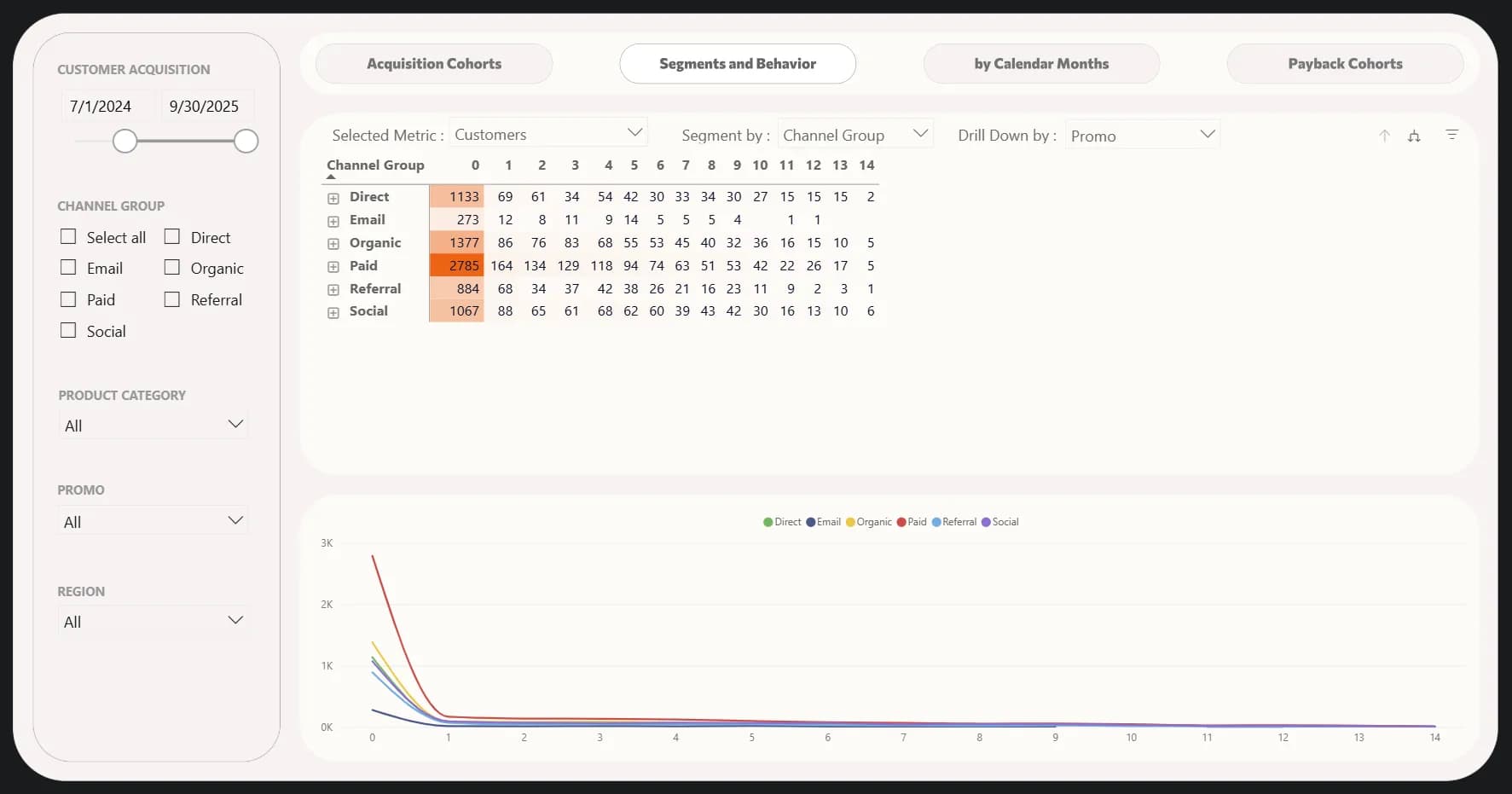
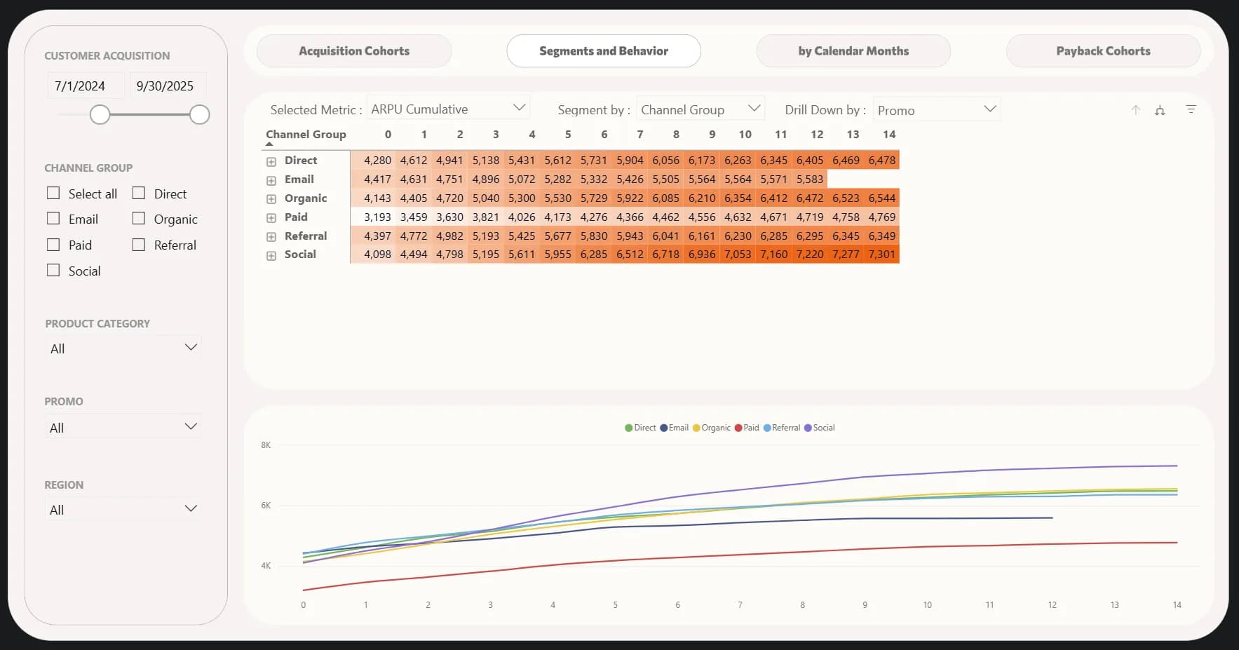
However, I agree with you — this view is not the most convenient for analyzing segments. That’s why the report also includes a Segments and Behavior tab.
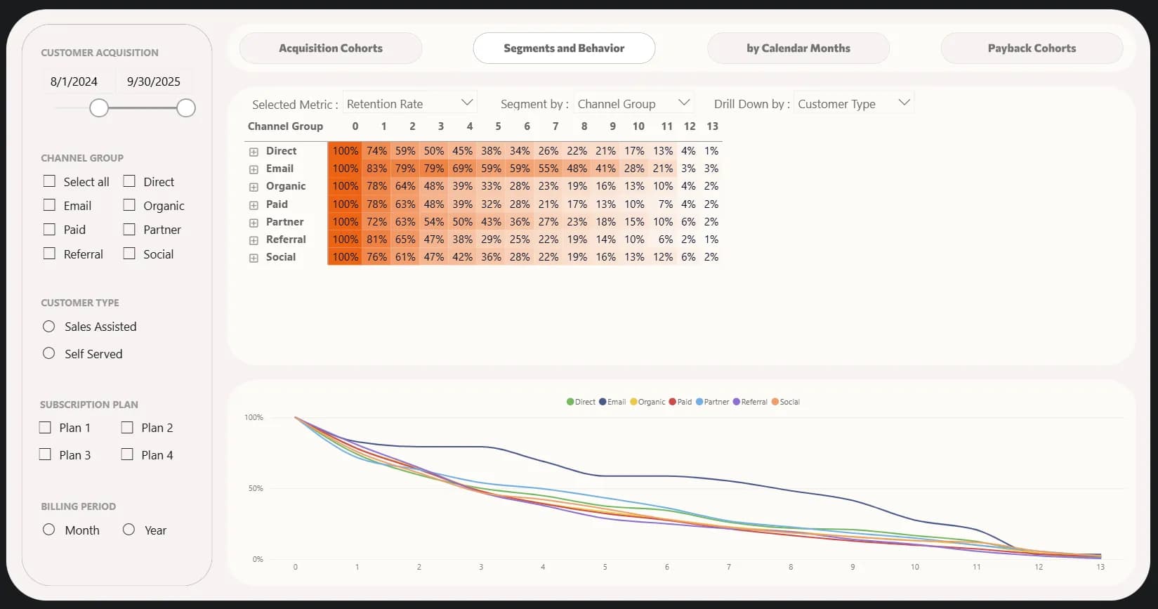
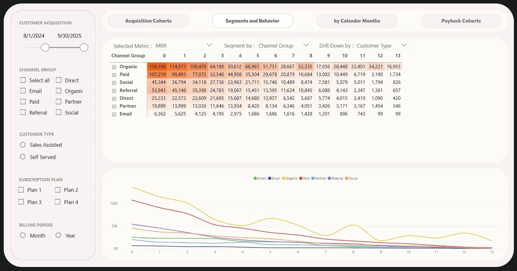
On this tab, we can, for instance, look at retention across different acquisition channels. Right away, we can spot the “champion” — users acquired via Email have the highest retention rate throughout their entire lifetime with the company. Which, overall, isn’t surprising — these are people who had already given us their contact earlier, and we converted them later with a helpful email campaign. So, let’s now look at the money — MRR. And suddenly, we see a different picture — our most significant acquisition channels are organic traffic, followed by paid advertising, while email comes last. Yes, the fact that it retains users well shows that our email campaigns have a positive impact, but it’s not the channel where we should focus our main marketing efforts.
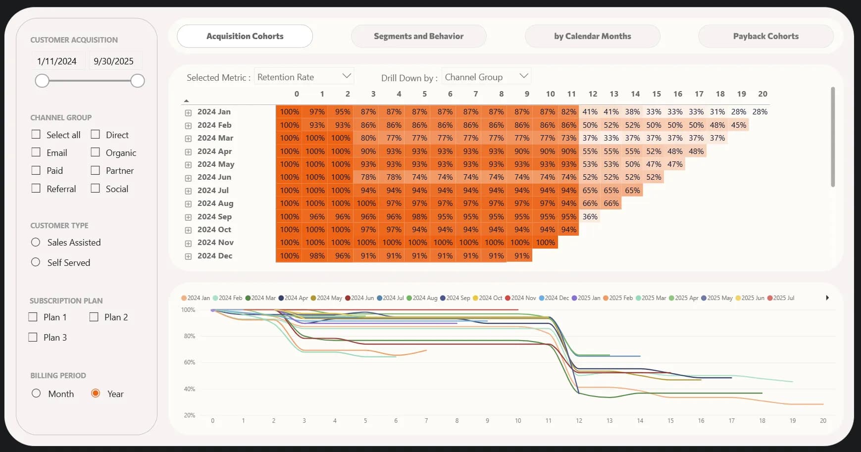
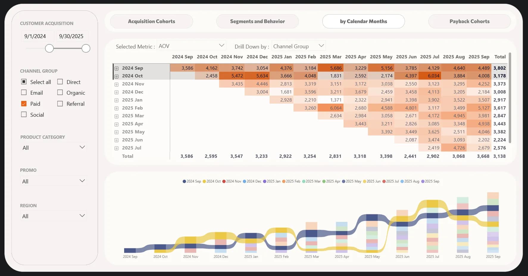
You’re probably already used to reading cohorts from left to right, but they can also be displayed in reverse order — by calendar months rather than calculated 30-day periods.
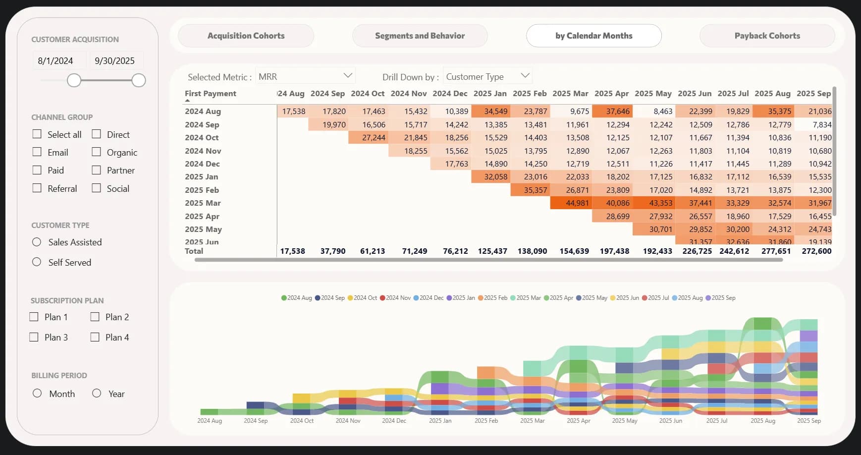
In this view, each row represents the month of the first payment. The first value in each row, along the diagonal, shows the amount of MRR received from customers in their first month. The subsequent values to the right show the revenue in the actual calendar month indicated in the column name.
Here we can see more details about the revenue received from our two winning cohorts — August 2024 and March 2025. For example, the August cohort brought in the largest share of revenue in January, April, and August 2025. These users and the activities that led to such revenue spikes definitely need to be analyzed further. We also need to understand what happened in March and May that caused such a critical drop in revenue.
It’s also worth exploring what contributed to the remarkable stability of the March cohort’s revenue — it remains almost unchanged month after month. On the chart below the table, we can see that the March cohort stayed among the top groups in terms of revenue share for five consecutive months.
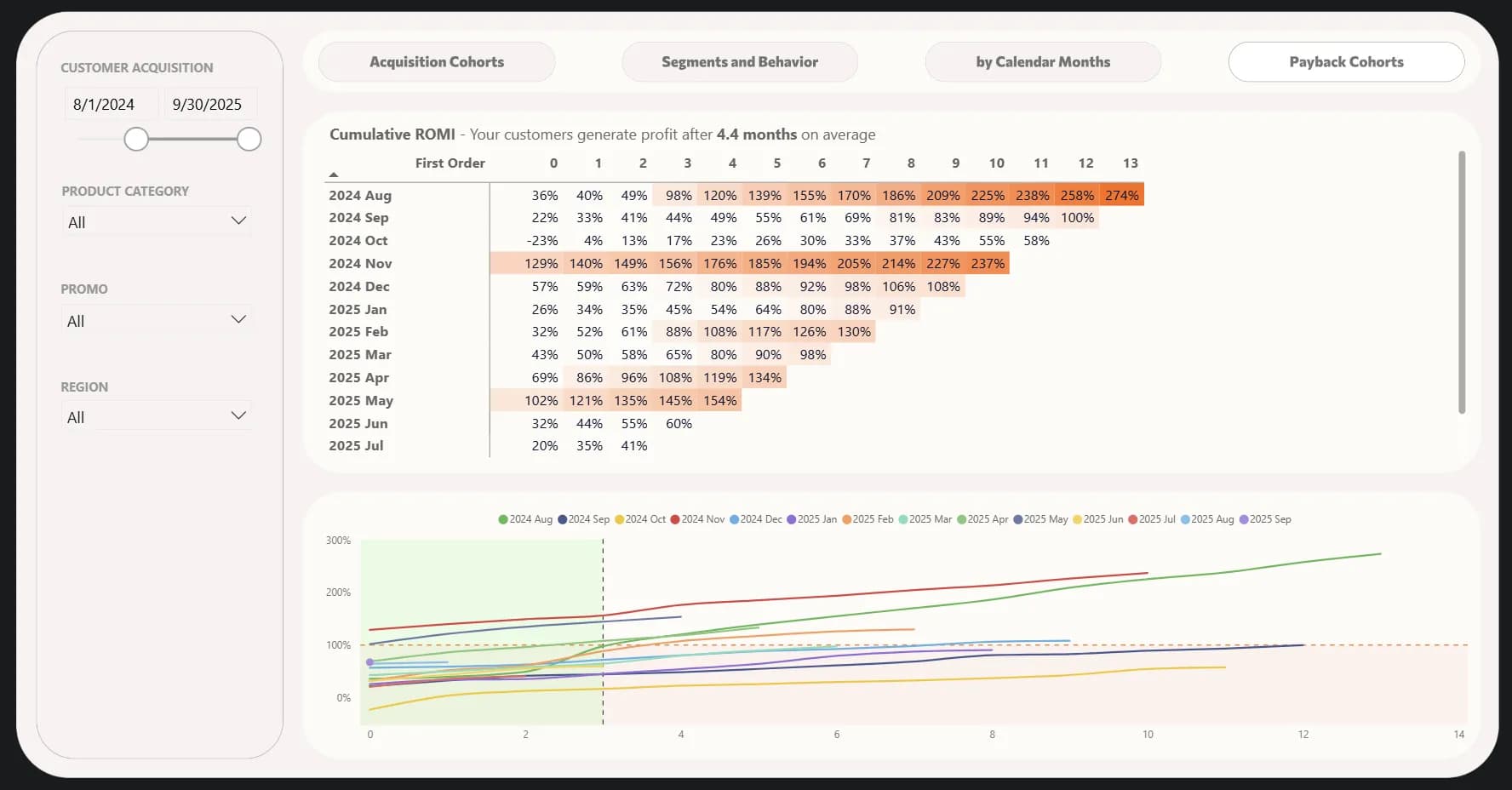
Let’s wrap up the SaaS cohort block with one of my favorite analyses — time to payback.
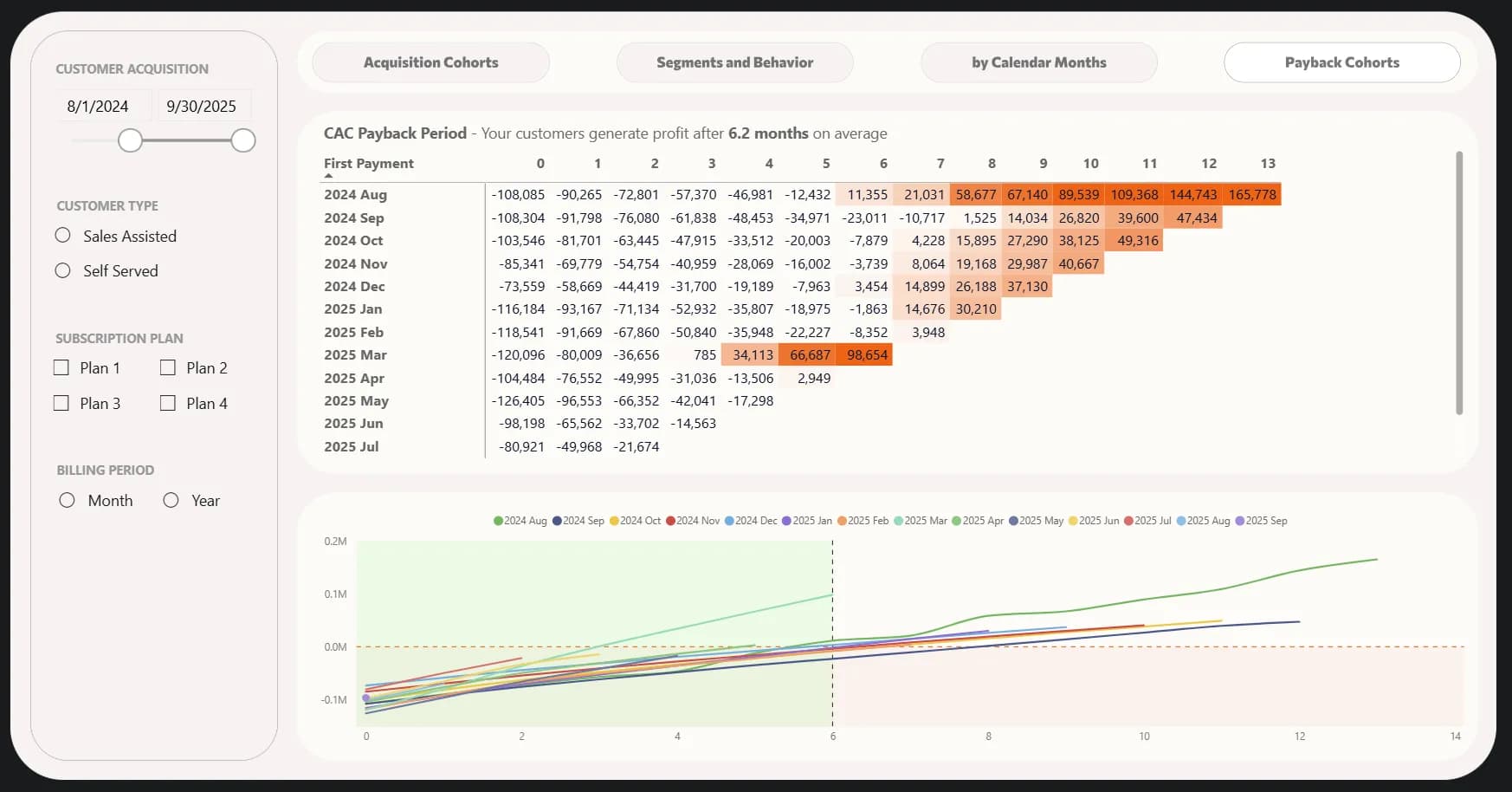
Ideally, SaaS acquisition investments should start generating profit in about six months. Our picture looks quite good — we start seeing profit roughly 6.2 months after acquisition (as indicated above the table). At the same time, we can once again learn from the March cohort — on the chart below, it confidently climbs upward in the fourth month.
This visualization is divided into four quadrants:
- Bottom-left quadrant – the first six months and the initial ratio of costs to profit. Cohorts are “allowed” to be here since we don’t expect positive returns within the first half-year.
- Top-left quadrant – the champion cohorts, which started generating profit even before reaching the six-month mark. We have one such cohort :)
- Top-right quadrant – the cohorts that eventually broke even and became profitable.
- Bottom-right quadrant – the underperforming cohorts. It’s a bad sign if they never move upward — meaning our acquisition investments in these users never pay off. Special attention should be given to those that stay in this quadrant for a long time — for example, the September cohort.
This visualization makes it quite easy to project future results simply by visually extending the lines. For instance, it’s highly likely that our most recent cohorts — May, June, and July — will start paying off even before reaching the six-month mark. Moreover, we invested more than usual in May, but our strategy there turned out to be quite successful.
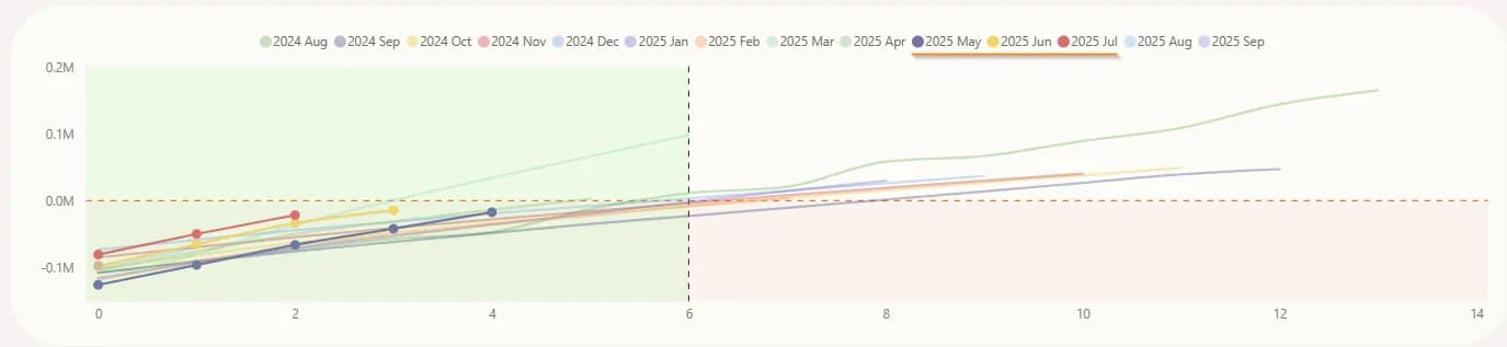
It could have gone in the opposite direction if the trend lines weren’t steadily moving toward the zero mark — the horizontal dashed line. And this way, you can roughly predict what to expect in advance. The same kind of “forecasting” effect is present in other similar charts we encountered in previous types of analysis.
Here are a few more examples you can apply in your own research:
- Behavior and onboarding analysis. Behavioral cohorts help identify which user actions lead to long-term success. For example, you can isolate a cohort of users who actively use the product (performing a certain number of actions or using specific features) and track what steps they took during their first days in the service. If it turns out that high-activity users performed a particular action X within the first few days, this suggests that new users should be intentionally guided toward that same action. Optimizing onboarding based on such insights helps increase the share of active and loyal customers. Conversely, you can analyze the cohort of users who quickly abandoned the service and identify what they failed to do or which features they ignored — this shows what needs improvement in training or product design.
- Evaluating the impact of product changes. SaaS products constantly evolve — new features are added, interfaces change, pricing plans are updated, and so on. Cohort analysis helps measure the effect of these changes. For example, if a major new feature or service improvement was launched in April, you can compare the cohort of users acquired after the update with those who joined earlier. A key signal will be whether retention or conversion rates improved in the “new” cohort compared to the “older” one. Similarly, you can assess the effectiveness of onboarding improvements: if you introduced a new onboarding tour for beginners, the subsequent cohort should show higher engagement and lower early churn.
E-commerce
If you jumped straight into this section from the menu without reading the previous one — no problem! Here’s the link again to the report we’ll be referring to next:
In the E-commerce field, cohort analysis is typically used to track customer behavior after the first purchase and analyze repeat sales. For online stores, as for any business, it’s far better and cheaper not just to attract a buyer once, but to make them a returning customer.
Imagine you sell coffee. In January, 100 customers made a purchase — that’s one cohort. In February, another 90 arrived — a different cohort. It may look like the business is growing — the customer base is expanding — but cohort analysis shows a different story: of the 100 “January” customers, only 10 returned in March, while the rest disappeared. That paints a completely different picture: the problem isn’t a lack of new customers, but poor retention of existing ones. The logical step, then, is not only to drive more traffic but also to launch a loyalty program or email campaigns to encourage repeat purchases.
This is the key value of cohort analysis: it shifts the conversation from “we have low sales” to “here’s the specific point where we’re losing customers.”
Our e-commerce example doesn’t stand out with a high retention rate. However, that doesn’t necessarily mean things are bad. If you sell products that are rarely repurchased — for instance, furniture, large appliances, or high-value goods — such a pattern might be perfectly acceptable. Although, for those niches, cohort analysis might not deliver much practical value. But for the majority of businesses where repeat purchases are desirable, the picture in the screenshot below would look quite concerning.
At the same time, we can clearly see a diagonal spike starting in November 2024. By tracing cohorts in that direction, we can easily identify that our marketing activities were successful during the Black Friday period.
Still, we’re facing a very low return rate — both in the first month and in subsequent ones. There’s also no visible seasonality — no pattern of recurring purchases after a certain period. Several issues could be at play here: low loyalty, weak brand recognition, or a marketing strategy focused more on acquisition than on retaining the existing customer base.
In such cases, the following steps are recommended:
- Launch a loyalty program. Customers need a reason to return specifically to you — discounts on repeat purchases, bonuses, special offers — all these classic strategies remain relevant and effective.
- Communicate with your customers. You do value your buyers, don’t you? Tell them that — send thank-you emails after a purchase, ideally personalized rather than generic. Include useful content like product care instructions or suggestions for complementary items.
- Improve your customer experience. Maybe customers don’t return because delivery takes too long or the support team isn’t friendly. Explore this area — anything in it can influence whether people come back.
- Run marketing campaigns not only for acquisition but also for retention. And, of course, don’t target everyone with the same generic offer. Segment your audiences to ensure relevance — and as a result, better conversion.
This is just the first report with a single classic metric, and we’ve already gathered several valuable insights that push us toward action. That motivation — to act — is where the real power of cohort analysis lies.
Naturally, as in the SaaS section, this report also includes other metrics beyond retention. Above the table, you can select:
- Customers – simply the number of buyers.
- Retention Rate – the percentage of customers retained, the metric we’ve already discussed.
- Frequency Cumulative – the cumulative number of purchases per customer. This metric shows the average number of purchases per customer over time and helps track the seasonality of repeat sales — when people are most likely to come back.
- Revenue – total revenue.
- Revenue Cumulative – cumulative total revenue, meaning each column shows the total revenue from the first purchase up to the current month.
- Revenue Retention – revenue retention rate. If we have good customer retention but those who make repeat purchases have low average order values, we’ll see a high retention rate but low revenue retention. For a business, revenue retention is usually more important than just customer retention.
- AOV (Average Order Value) – the average purchase amount.
- ARPU Cumulative – the cumulative revenue per customer — essentially, how much money each acquired buyer brings to your business over the entire relationship.
This last metric is relative, but it’s very effective for identifying trends at the level of the average customer. For instance, we already noted that Black Friday performed very well. If we look at Revenue, that month will stand out dramatically compared to others. But ARPU Cumulative shows that we shouldn’t celebrate too soon — the November cohort turns out to be average in long-term value, not the best. Meanwhile, we can clearly see the August cohort, which consistently shows a strong increase in per-customer value even a year later. This is the cohort worth studying — understanding what made it successful could help replicate those strategies going forward.
Additionally, the report highlights an unpleasant finding — in June, we started acquiring customers with the lowest average order value, and this trend has persisted for four months. Unsuccessful campaigns also deserve investigation so we can avoid similar mistakes in the future.
That’s the beauty of this kind of cohort analysis — it allows you to see such nuances. If we were only looking at the average order value for the past month, the strong results from the August 2024 cohort would have offset the weaker ones, hiding the real issue — the low-quality acquisition of recent months.
Above the table, you can select an additional breakdown to further segment the customers you’ve acquired. The available breakdown options include:
- Channel Group – the group of traffic channels from which customers made their first purchase.
- Product Category – the category of products in which the first purchase was made.
- Promo – the promo code value, if one was used for the first order.
- Region – the geographic region where the customer’s first order was delivered.
For a grouped segment analysis, there is an additional tab called Segments and Behavior. On it, we are primarily interested in acquisition channels. By reviewing the statistics, we can quickly conclude that our online store relies heavily on paid advertising channels for customer acquisition.
However, we should probably pay more attention to other channels and strengthen them, since in terms of revenue per customer, our paid advertising performs the worst.
That said, let’s continue discussing the advertising acquisition channel and not dismiss it too quickly, as it’s the easiest to manage. To analyze successful strategies, we can use a right-sided cohort. Here, we’ll filter only paid traffic and display the average order value (AOV) as the key metric.
We can see that even before Black Friday, we attracted quite a good audience with a solid average check in September and partly in October. The September cohort still has one of the highest AOVs, and by the 13th month, it’s actually the highest overall. The October cohort also held strong leadership for quite a while, then dipped for three months and recovered over the following three.
We need to analyze the strategies we used in September–October 2024 and apply the successful approaches in our current campaigns.
And finally — one of the most valuable cohort insights: time to payback. One version of this analysis I’ve already described in one of my previous articles on marketing analytics for e-commerce. In this piece, I won’t repeat that approach — instead, let’s look at this metric through the lens of ROMI (Return on Marketing Investment) calculated cumulatively.
In each row of the table, we calculate the total gross profit generated by the cohort up to a given month (shown in the columns), subtract marketing costs, and divide the result by those same marketing costs. In this example, we only have data on the payback of marketing investments, so there’s no filter by traffic channel.
And what we see is a very mixed picture. Even though, on average, our investments pay off after 4.4 months — which is relatively decent for e-commerce — the breakdown by acquisition month tells a much more interesting story. The November cohort, which again corresponds to Black Friday, stands out clearly — it was profitable almost immediately. The May cohort also performed well: at first, we merely broke even, but the users acquired that month kept buying afterward.
At the same time, there are far more problematic cohorts — those acquired in September and October 2024, as well as in January and March 2025, still haven’t reached profitability, even though their fourth month has already passed. Once again, the strong performance of the November 2024, August 2025, and May 2025 cohorts may blur the overall picture if we look only at the aggregate ROMI across all customers, without separating them by acquisition period. Such an aggregate view would likely hide the fact that in June and July, our marketing activities were critically unprofitable.
Here are a few additional ideas that may be useful for your own analysis:
- Effectiveness of discounts and promo campaigns. If your analysis shows that promo buyers rarely return for repeat purchases, it means discount campaigns are attracting less loyal, one-time customers. Based on this insight, you can adjust your strategy — for example, by introducing extra retention measures for promo-driven customers or by re-evaluating the overall scale of your sales events.
- Seasonal trends and inventory planning. By analyzing time-based cohorts, you can identify seasonal effects. For instance, cohorts starting in November–December, right before the holidays, may show higher initial purchase volumes but lower repeat activity afterward, since many purchases are gift-based or impulse-driven. In contrast, spring and summer cohorts may display different behavior patterns. Understanding these trends helps forecast demand more accurately and plan inventory and marketing campaigns for different seasons. If a particular seasonal cohort demonstrated especially strong sales, you can try to recreate that success the following year. Essentially, seasonal cohort analysis answers the question: “Do customers acquired during holiday periods behave differently from those acquired during regular months — and how can we use that insight to our advantage?”
B2B
Of course, B2B differs from the two previous business types, but if we think logically, every business wants to retain its customers and increase revenue from them. And for any company, it’s cheaper to keep existing clients than to acquire new ones.
At this point, I decided not to stretch this article endlessly, so in this and the next section there will be no visual examples. Instead, we’ll talk about cohort ideas that are worth exploring for B2B — and I believe you already understand the main principles from the previous two sections. B2B business is characterized by longer sales cycles, higher customer value, and more complex decision-making processes. Cohort analysis for this type of business helps to better understand client interaction dynamics and optimize both the product and marketing/sales strategies. In practice, you can analyze the following:
- Customer retention. In the B2B sector, long-term contracts are common. You can group clients into cohorts by the quarter or year when they became customers and track what share renews their contracts after 1, 2, or 3 years, etc. This shows the retention level of B2B clients over time. For example, if the cohort of clients acquired in 2022 retained 80% of contracts after a year, while the 2023 cohort retained only 60%, that’s a strong insight. Perhaps market conditions changed, or there were product issues. Cohort analysis gives a clear picture of how yearly client cohorts generate revenue and how many “churn” over time — which is crucial for assessing the health of a B2B business and forecasting revenue.
- Segmentation by client type. In B2B, it’s essential to understand which segments your product works best for. The cohort approach can group clients not by time but by attributes — for instance, by company size (small, medium, large enterprises) or by industry, and then compare their retention and profitability metrics. If the analysis shows that your platform has a significantly higher renewal rate among large enterprises than among small businesses, that’s a sign to focus sales and support efforts on that segment. Cohort analysis by region can also reveal where your product delivers more value. Such insights help adjust product positioning and development to fit markets with the best response.
- Product usage by role. In corporate software, different users within a client company often play different roles — for example, administrators, sales reps, managers, or analysts. Cohort analysis can also be applied here: group usage data by user roles. Imagine a platform with five user types. By splitting activity into cohorts by role, you can see how each group adopts and uses the product. This helps identify if a certain role lags in engagement or retention. For instance, if marketers in client companies rarely return to the product after the first month — that’s a red flag. It might mean the product isn’t valuable enough for them or they need dedicated training. Additionally, after product updates, you can monitor how different roles react to the changes. This is important because in B2B products, improvements for one user group may inadvertently worsen the experience for another — so balancing these effects based on data is key.
- Marketing optimization and personalization. Just like in SaaS and E-commerce, cohort analysis helps evaluate how different campaigns or acquisition approaches perform across various segments. For example, you can compare a cohort of leads generated from a webinar versus those from a trade show, and track their conversion into sales and subsequent retention. This helps optimize lead generation spending and improve ROI.
I’ve listed ideas specific to B2B, but the methods described earlier are equally applicable here. You may have noticed similarities while reading the previous sections — and that’s true, because at a high level, the principle of this analysis remains the same: segment, observe, conclude, and act.
Mobile Apps
For mobile applications, cohort analysis is also an essential tool that helps understand user engagement and churn dynamics over time. Mobile products are often evaluated through retention metrics — and as you already know, these metrics are calculated using a cohort-based approach. The key analytical focuses here are as follows:
- User retention. New app users are grouped into cohorts by their installation date, and for each cohort, you track how many users return to the app after 1 day, 7 days, 14 days, and one month. These retention curves clearly show the app’s “stickiness.” For example, if on average, out of a cohort of 1,000 new installs, only 30% open the app the next day, 15% after a week, and 5% after a month — these are your baseline retention rates. Cohort analysis allows you to compare such curves across different time periods — for instance, whether user retention improved after the latest update. And if you find that the cohort acquired through a specific marketing campaign has especially low retention, that’s a strong signal of mis-targeted advertising.
- Identifying critical onboarding drop-off points. Cohort analysis helps pinpoint where new users drop off during onboarding. For example, you can look at a cohort of users who completed the tutorial but didn’t reach the core functionality and see how many of them return later. These cohort slices essentially serve as activation funnel analysis with a time dimension. For instance, you might want to know how many users who installed the app later came back and performed action X. This, too, is a cohort approach — the cohort is based on the installation event, and the metric is the completion of a key action. The results show how effectively the app guides newcomers toward the core experience. If only a small share of a cohort reaches that valuable action, it’s a sign that onboarding should be simplified or users should be more actively encouraged to get there.
- Engagement and usage frequency analysis. With cohorts, you can measure not just whether a user returns, but how often they perform specific actions. For example, you can analyze users who installed the app in a given month and calculate the average number of sessions or time spent per user within that cohort each week after installation. This helps reveal whether users are forming a habit over time — or losing interest. If, for instance, in the January cohort, users averaged 5 sessions per week during the first four weeks, while in the February cohort it increased to 7 sessions, that may indicate improved engagement.
- Monetization and payment conversion. Many mobile apps operate on a freemium model or include in-app purchases. Cohort analysis helps measure what share of users convert to paying customers over time. For example, take the cohort of new installs in a given month and observe: after one month, X% of them have made at least one purchase; after three months, Y%; with an average purchase value of Z. This essentially reflects the value and ROI of that cohort. The logic here is similar to what we discussed earlier: determine whether the users acquired through advertising break even within N months. If a cohort shows insufficient revenue, you should either improve monetization (e.g., introduce new paid features, adjust pricing) or rethink acquisition costs.
Conclusions and tips
That was quite a journey, wasn’t it? Let’s wrap up this article.
Cohort analysis helps you segment your customer base by shared characteristics and track their actions over time.
It allows you to see the real picture — the one that’s often hidden behind average indicators.
At the same time, keep in mind an important nuance: when you segment your data, the size of each group decreases. Don’t rush to make bold conclusions based on small cohorts. It’s better to form hypotheses and test them.
Combine different types of cohort segmentation and don’t rely only on absolute or only on relative metrics. Look at the data from multiple angles — no one knows in advance where those hidden “aha moments” are waiting :)
Cohort analysis can answer the key questions for all types of businesses:
- Retention. How many users stay active? What drives retention?
- Product engagement. Do new features influence long-term engagement?
- Marketing effectiveness. Do users acquired from certain campaigns retain better than others? When do acquisition investments pay off?
- Customer value. How does the revenue from a group of users change over time?
- Churn factors. Identifying cohorts with low retention can highlight core product issues.
- Seasonality. Do cohorts behave differently during certain times of the year?
Despite its potential power, start simple. Build your first cohorts to determine retention rate. For this, all you need is a table containing:
- the customer identifier (even an email is enough),
- the date of their first interaction,
- and the dates of all subsequent interactions.
Then:
- calculate the difference between the first and subsequent interactions, divide the result by 30, and round it down using the FLOOR function;
- create a pivot table with the month of first interaction in rows, the cohorts (from the previous step) in columns, and the number of customers as values;
- finally, divide the number of customers in each cell by the number of customers in the zero cohort of that same row.
Once you’ve built it, identify churn trends and start testing hypotheses to improve the situation. Later, expand your analysis by adding other types of cohorts.
This systematic approach will help you make more informed decisions, increase customer loyalty, and grow your business.
And if you ever need a hand along the way — your analytics team will always be there to tackle even the most complex challenges.
Comments
Share your thoughts and ask a question
Loading comments...