
SPEKA Case
About the Client
SPEKA (speka.ua) is a Ukrainian online media outlet that talks with its audience about business, technology, and the people shaping the country’s new economy today. The publication covers a wide range of topics, including entrepreneurship, science and space, artificial intelligence, security and defense, lifestyle, and more, and combines breaking news with in-depth expert analysis.
What sets SPEKA apart is its content model: some materials are created by the editorial team, while others come from the audience itself through the UGC platform “Spilnota” (Community). It’s not just a blogging platform but a living expert community where entrepreneurs, top managers, and tech-sector representatives share their own experience directly with readers.
The Challenge
Media projects live on speed and publishing volume: every day, dozens of pieces come out from the editorial team, and even more from Community authors. In these conditions, it’s critical for the newsroom to understand which content and which authors actually work for the audience, and to have this data in one place for quick analysis and decision-making.
Our collaboration with the SPEKA team is a story about how trust is built on real results. It all began long before the SPEKA project: first, we joined forces on their first project, The Page, a publication that belongs, together with SPEKA, to the “Digital Economy” media group. The initial request came with a classic media pain point: data was scattered across different systems (GA4, Search Console, CMS), and combining it manually was too complicated. We solved the problem by building an automated editorial dashboard. Then the thepage team worked with the report for a while, saw how much the tool had simplified their work and boosted the team’s efficiency, and decided to scale this successful experience further. That’s how we brought our solution to SPEKA as well, building on the already proven logic with new, expanded capabilities, including audience reactions (likes, dislikes, comments, complaints) as a content quality indicator and author segmentation by activity.
During implementation, we focused on the following tasks:
- show site and content performance in real time and over time (views, engagement, scroll depth);
- evaluate the performance of each author individually and compare actuals against the plan;
- identify evergreen content: articles that continue to bring in search traffic months after publication;
- connect search analytics (Search Console) to monitor positions and CTR.
Preparatory Work
Stage 1. Building the data warehouse
To build the reports, we needed to collect data from different systems in a single place:
- Google Search Console (GSC)
- The internal CMS
- Google Analytics (GA4)
- Google Sheets
The choice of warehouse was obvious: Google BigQuery. It offers native integration with Google services (and there were as many as three of them: Google Analytics 4, Search Console, and Google Sheets), easy connection to business intelligence tools, including Power BI, and at the same time a flexible, affordable pricing model with free usage limits (you can read about these and other advantages in this article).
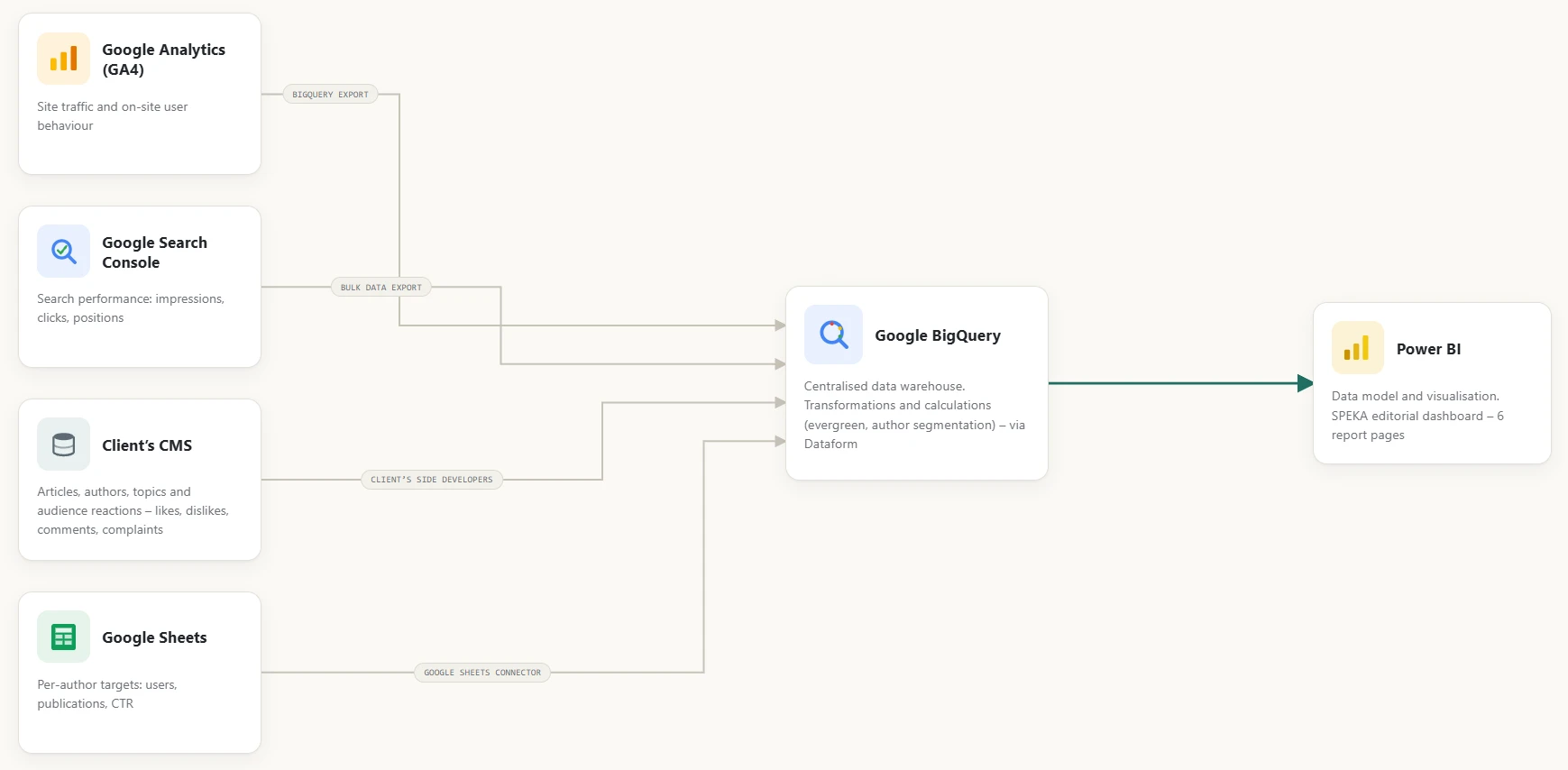
While we were setting up the integration with Google services, the SPEKA colleagues, on their side, implemented the transfer of data from their own CMS about publications, authors, and article interactions to BigQuery according to our technical specification.
Before the export began, we agreed on the data update logic: every hour during working periods, with no updates on weekends and other periods of non-use. On the one hand, this made it possible to achieve maximum data freshness in the report, and on the other, to minimize data processing costs when it isn’t needed.
Stage 2. Data processing
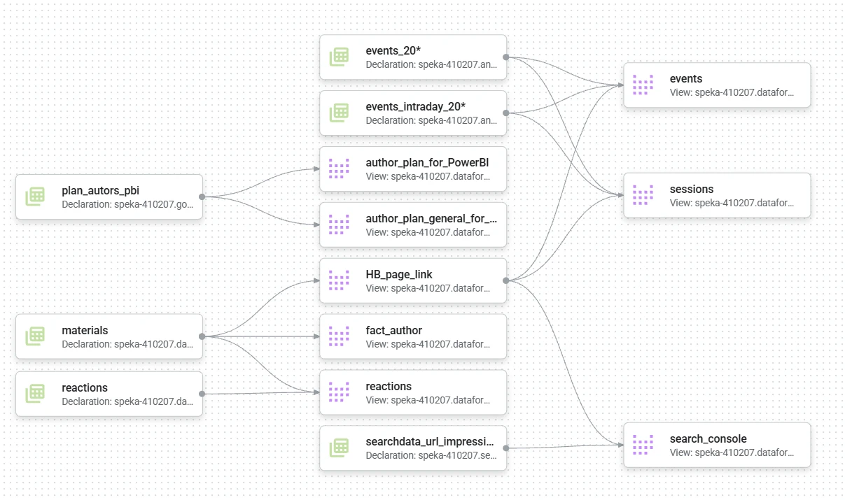
We set up all calculations and the preparation of aggregated data in BigQuery through Dataform. This tool helped us replace manual work with an orderly process, and thanks to version control, we always know who made changes and when. In addition, Dataform builds a clear graph that visualizes all the connections: you can immediately see where the data comes from and how it affects the final reports.
We respect our partner’s confidentiality, so the graph below shows modified data that gives a general understanding but doesn’t fully reveal the solution.
Stage 3. Business logic and calculations
On top of the raw data, we built several layers of business logic specific to a media project, including:
- Evergreen content. An article is considered “evergreen” if it has been collecting traffic for at least the last 3 months, 70% or more of its traffic comes from search, and its Google position (according to Search Console data) is within the top 20.
- Author segmentation by activity. Active (at least 1 publication every month for 3 months in a row), moderately active (2 publications in the last 3 months), low-activity (1 publication in the last 3 months), and dormant (0 publications in the last 3 months, but previously active).
- Plan vs. actual by author. Monthly targets for unique users, number of publications, CTR, and other metrics, with a comparison of actuals and forecast against these planned figures.
Report Implementation
We chose Power BI as the main reporting tool primarily because it combines flexible configuration with the broad interactive analysis capabilities that the project required. However, it has other advantages as well.
The demo report displays anonymized data to protect trade secrets, but visually it fully matches the client’s original report.
The demo is designed for viewing on a computer, so it may be less convenient to use on mobile devices. We recommend exploring the reports from a desktop.
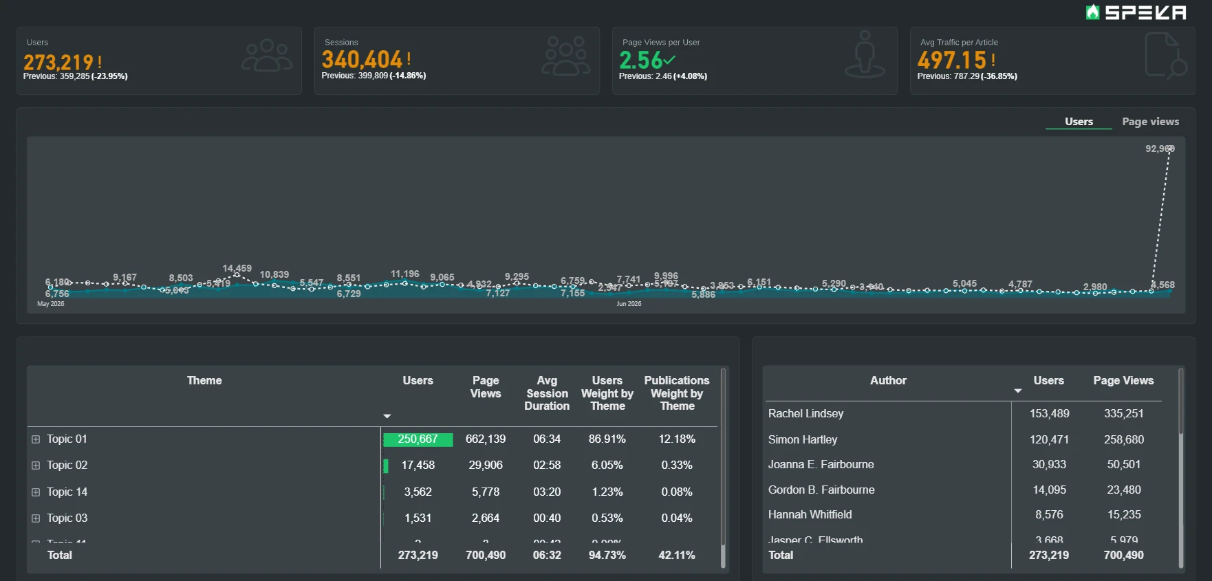
This report uses our own date filter, which lets you quickly select period presets (if needed) and flexibly control how the previous period is displayed for comparison.
Main Report Page
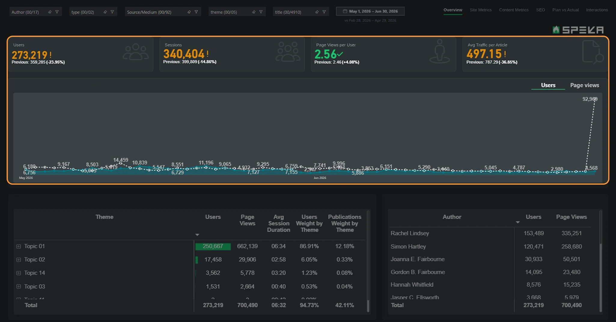
The page shows the following:
- Is the site’s audience growing overall? For a quick comparison of periods, we placed a block of KPI cards with key engagement metrics on the left, while the chart next to it makes it easy to track the metrics over time.
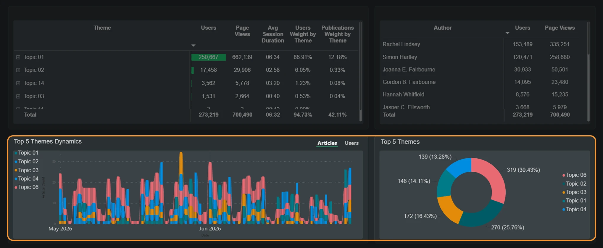
- Which content topics work best? The chart of topic dynamics by number of users (which can be switched to number of users) shows which topics are gaining or losing popularity.
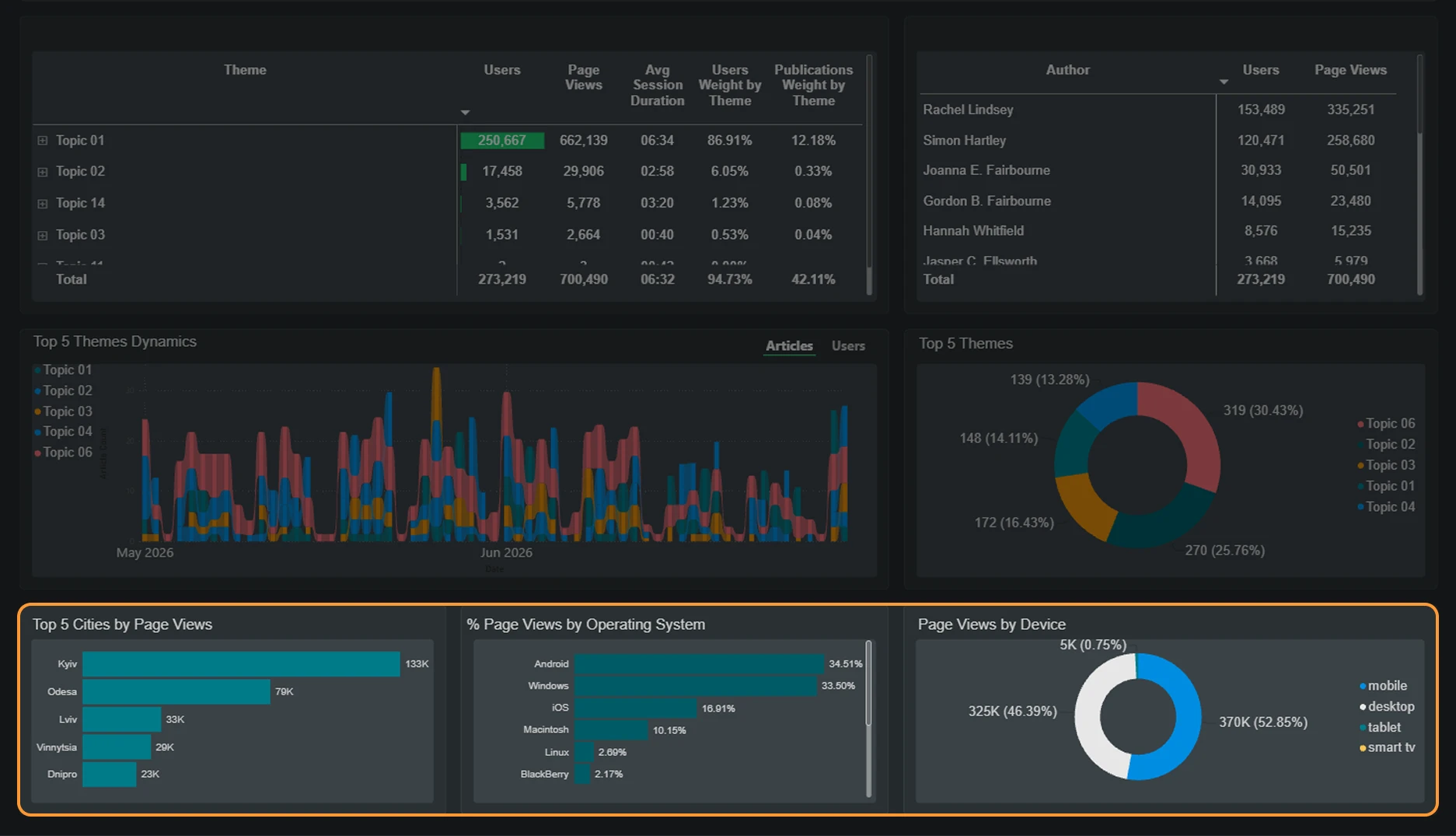
- Where does the audience come from, and what devices do they use? The top 10 cities by views and the breakdown by device category and operating system.
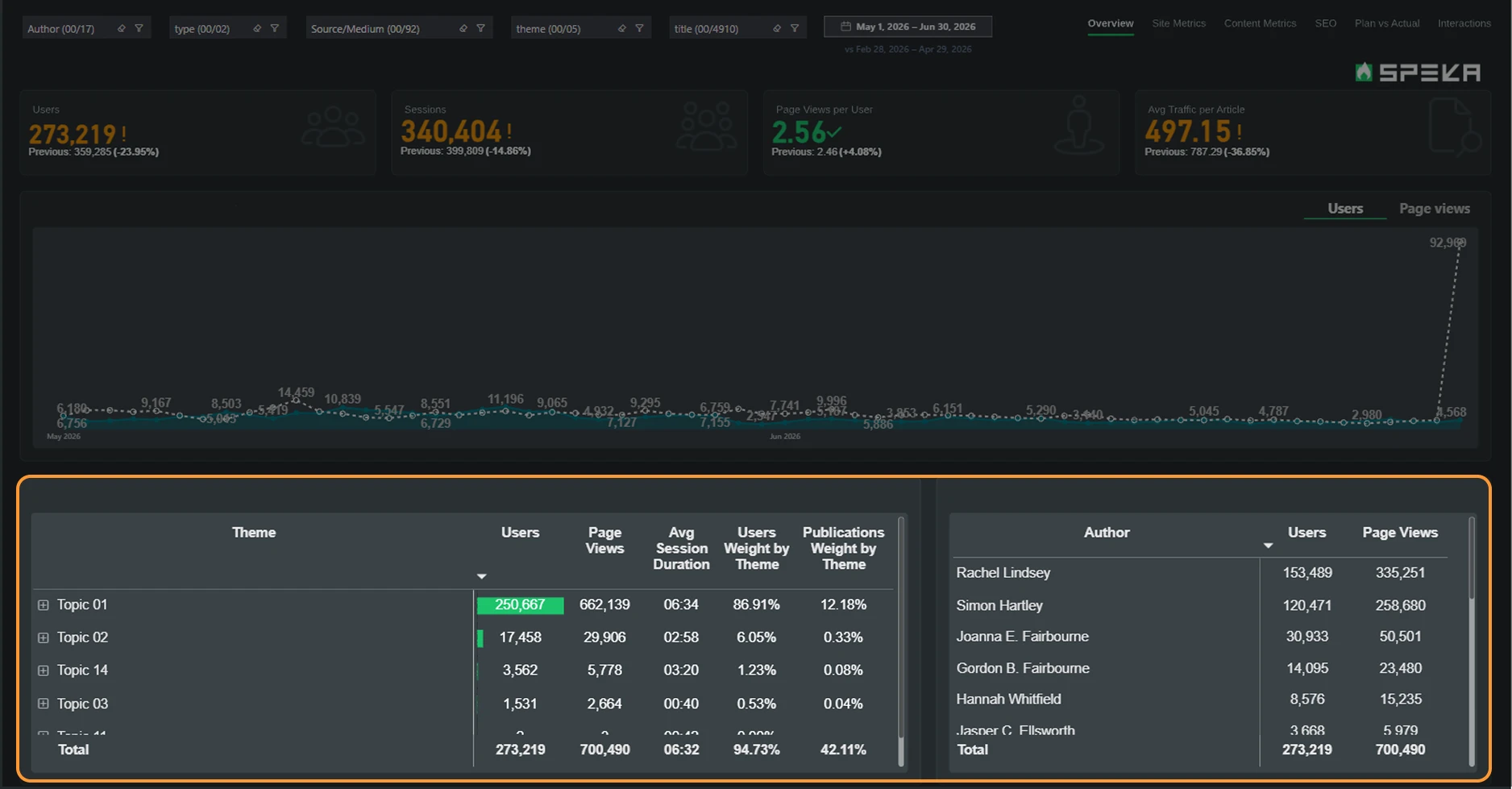
- Breakdown by topics and authors in tables. The first reveals topic performance, with the option to drill down to the level of an individual piece, while the second helps the editor-in-chief or manager analyze the performance of each author.
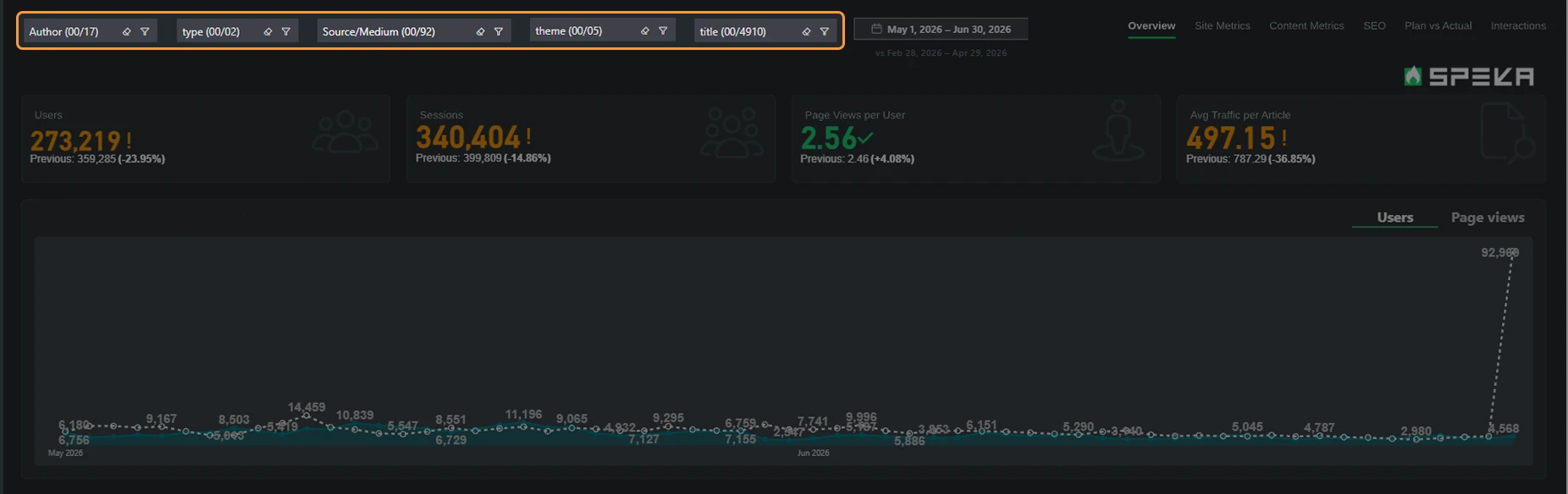
- Isolating a segment for analysis. Thanks to the interactive filter panel, the dataset can easily be split into the slices you need. This makes it possible to isolate specific segments, such as a particular topic or author, and analyze their impact on the overall dynamics.
The dashboard consists of several pages, each of which details a separate area of analysis. To better convey the essence of the report, here are examples of questions you can find answers to on the other pages of this report.
Site Metrics
- Is the site growing, and is engagement with the content improving?
- Which traffic source really works?
- What is the ratio of new to returning visitors, and how well does the site retain its audience?
Content Metrics
- What is the overall content performance for the period?
- How does content output change over time, broken down by “Editorial vs. UGC”?
- How actively are authors registering in the Community?
- Which authors generate the main share of traffic, and through which content?
- Which articles took off over the last 30 days?
- Which content is worth promoting again?
- Which authors are active, and which are not?
Search Traffic (SEO)
- Is the site’s search visibility growing, and what changes are happening over time?
- Which pages are losing positions in search?
- Through which display channels does the search audience arrive?
- Which specific pages get the most clicks and impressions, what are their position and CTR %, and how has this changed compared to the previous period?
Plan vs. Actual Analysis
- Is each author on the editorial team meeting the plan for the number of publications per month, and by how much?
- Will an author catch up with the plan by the end of the period?
- Who on the team is falling behind, and who is ahead of plan in a given month?
- What is the plan-completion trend for a specific author, and how do their metrics look against the whole team for the selected month?
Interactions
- Which type of reaction dominates, and for which authors?
- Which articles need the editorial team’s attention, and which are worth taking as an example?
- How does the selected type of audience reaction change over time?
- Does the audience reaction differ depending on the type of author or topic?
Results
Now the speka.ua editorial team sees traffic, search results, and audience reactions in a single dashboard, without manually combining GA4, Search Console, and the internal database. This makes it possible to evaluate each author’s performance against the plan, find evergreen articles worth promoting again, and quickly respond to articles that are losing positions in search or provoking a negative audience reaction.
We didn’t simply transfer a ready-made dashboard from thepage.ua; we adapted and expanded it for our partner’s second media project. As a result, SPEKA gained the same capabilities that had already proven their value at thepage.ua, plus a deeper level of analytics: audience reactions and author segmentation by activity.


Thank you to the ProAnalytics team for your professionalism and attention to detail.