
Stripo Case
About the Client
Stripo is an email builder used by more than 1,700,000 people — from solo marketers to the marketing teams at Adobe, Microsoft, Amazon, Airbnb, and Spotify. According to the company, Stripo is used by 65% of Fortune 100 companies. The drag-and-drop editor lets users build a responsive email without code and export it to more than 90 email service providers. Independent ratings put the product at 4.8 on G2 and 4.9 on Capterra. (All figures in this section are as of July 2026.)
Behind these numbers lies a specific analytical challenge. Stripo's customers arrive through vastly different paths: organic search, paid advertising, partner integrations, direct events. And the channel that first brings a user to the site is often not the same channel that ultimately brings the one who will go on to pay for months. Until these paths are brought together into a single picture, the question of "where to direct the marketing budget" has no reliable answer. This is exactly where our collaboration began.
The Problem
Standard web analytics usually stops at sign-up. For a freemium product, that's not enough: sign-up costs nothing, while the value comes from the organizations that convert to paid plans and stay for months. Stripo's question wasn't "which channel drives more sign-ups," but "which channel brings customers who pay and stay with us for the long term."
Two things stood in the way of answering it.
The first was a data gap. On-site behavior lived in Google Analytics, while payments, subscriptions, and revenue lived in the product's internal database. Until these two worlds were connected, it was impossible to trace the path from a first visit to the revenue it eventually generated.
The second was the attribution model. The familiar "last click" gives all the credit to the channel that closed the sign-up, and devalues the channels that brought in and "warmed up" the user earlier. With this picture, it's easy to overinvest in the channel that merely reaps the harvest, and underfund the one that actually grows it.
What was needed was an end-to-end system that connects traffic, sign-ups, subscriptions, and revenue — and honestly shows the contribution of every channel, not just the last one.
What We Did
We built an end-to-end system in four layers. First, reliable data collection via server-side GTM. Next, we brought on-site behavior and revenue from the product database together into a single BigQuery warehouse and calculated attribution using four models at once — first click, last non-direct click, and two data-driven models. On top of this data sits a Power BI report that shows the path from visit to first payment. And on top of that is an AI assistant that lets the team query this data in plain language.
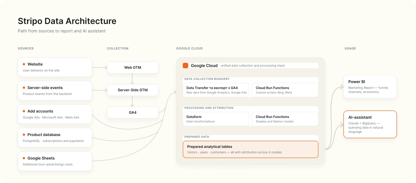
Below, each layer in more detail.
Foundation: A Single Warehouse and Fair Attribution
First, we closed the data gap. We collected on-site behavior via server-side GTM — a more reliable and better-controlled method of collection than the classic browser-side approach. On our own, we brought web analytics, ad account data, and additional costs together into a single BigQuery warehouse. In parallel, Stripo's developers loaded the internal product database with payments and subscriptions. All further analytics are built on this intersection of different worlds — on-site behavior, advertising system data, and real revenue.
Next, attribution. Instead of a single view, as is typically the case with last-click attribution, we evaluated the role of each channel using four different models, since one of the client's main requests was to assess the fair contribution of every traffic channel:
- First Click and Last Non-Direct — rule-based models with predefined value-distribution rules: credit goes to the first or the last meaningful touchpoint, respectively.
- Shapley Value and Markov Chains — data-driven models: channel-influence coefficients are calculated from actual channel chains leading up to conversion, so these models adapt to the specifics of a given project and, through training, independently assess each channel's influence on achieving the target action.
For more detail on Shapley Value and Markov Chains and their practical limitations, see our article: Data-Driven Attribution in GA4.
Why four models instead of one? Because no single model is "the truth." Models like First Click and Last Non-Direct are simple and clear, but crude: they give all the credit to the first or last touchpoint and miss the channels that worked in the middle — the ones that bring the customer closer to a decision without themselves "closing" the sign-up. Data-driven models distribute credit more fairly, based on each channel's actual contribution, and bring these undervalued touchpoints to light. At the same time, their defining feature is that they need a substantial amount of data to train properly; otherwise they will barely differ from the simple models and won't provide additional value. This is why there is no single "correct" model. It's useful to look at the data from several "points of view" at once: this way you can see where a given channel is valuable under any logic, and where its weight is only noticeable under certain conditions — for example, many first-touch attributed conversions from Meta Ads, while that same channel rarely closes the lead. This is a more reliable basis for budget decisions than a single classic "last click."
The Report: The Entire Acquisition Journey in One Place
On top of this data, we built a Power BI report that the team uses almost every day. Its job is to show marketing effectiveness: how acquisition turns into new paying customers and which channels deliver that result.
Demo report displays anonymized data to preserve trade secrets, but visually it fully matches the client's original report.
The demo is designed for viewing on a computer, so usability on mobile devices may be limited. We recommend exploring the reports from a desktop.
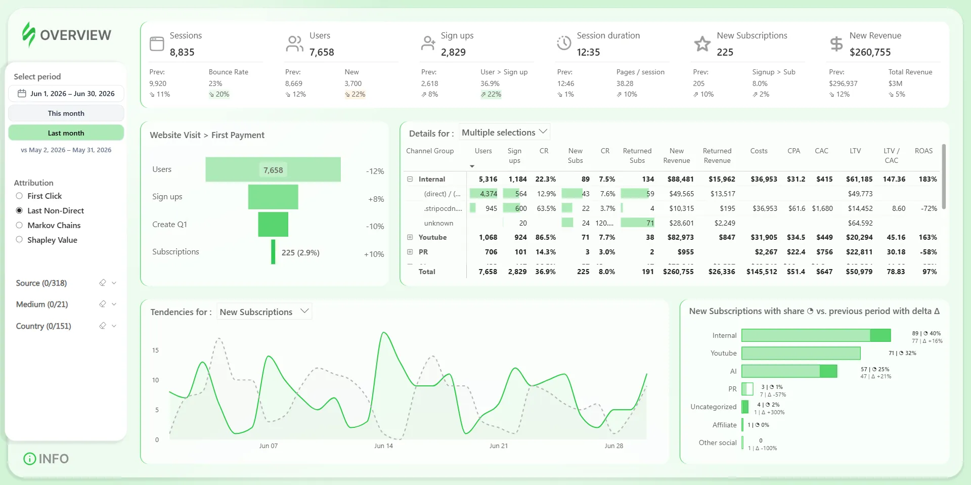
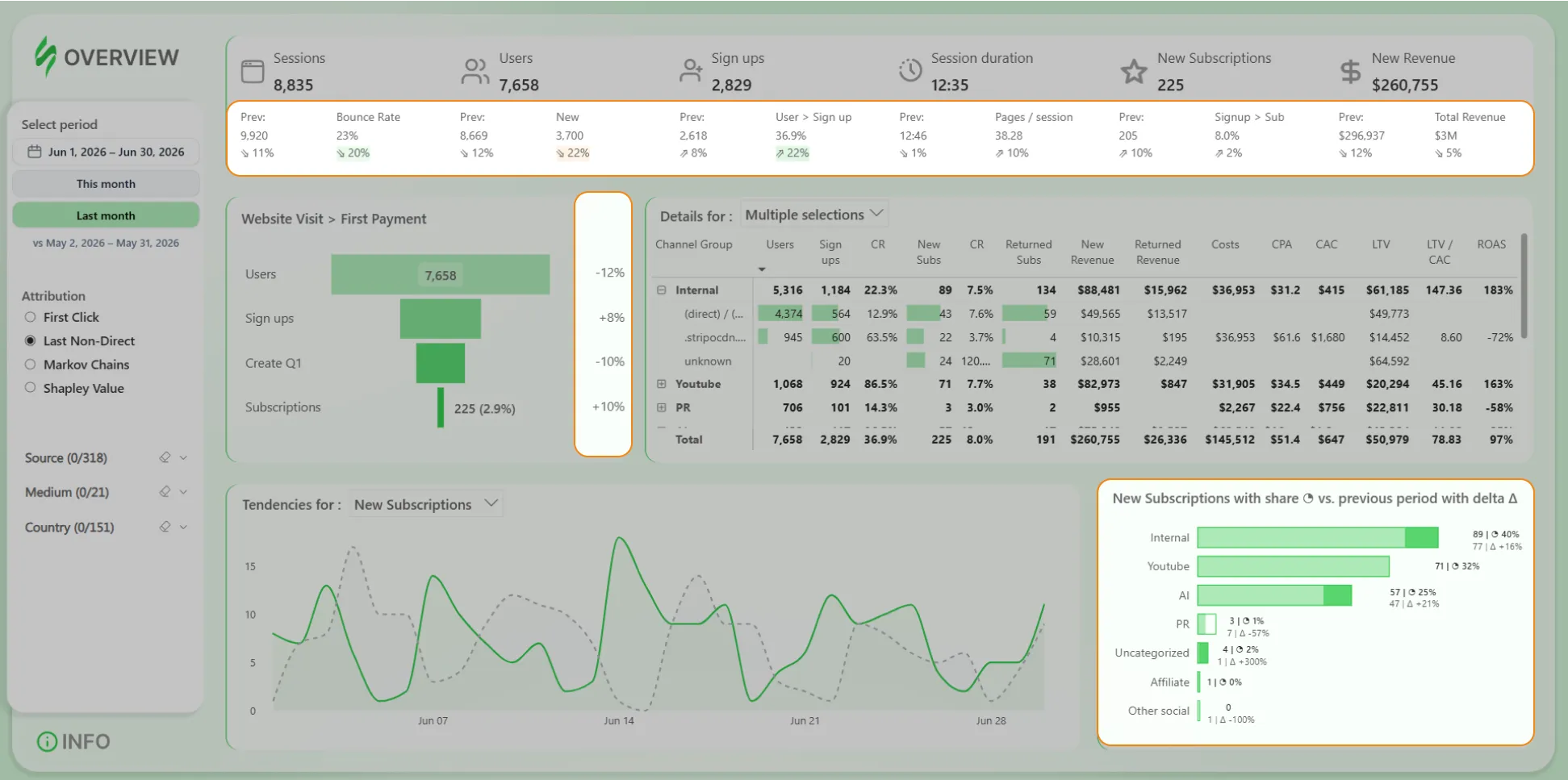
Acquisition funnel with conversions. From visit → to sign-up → to creating the first template → to first payment. At every step you can see the count and the conversion rate to the next step, so it's immediately clear exactly where users drop off on the way to payment.
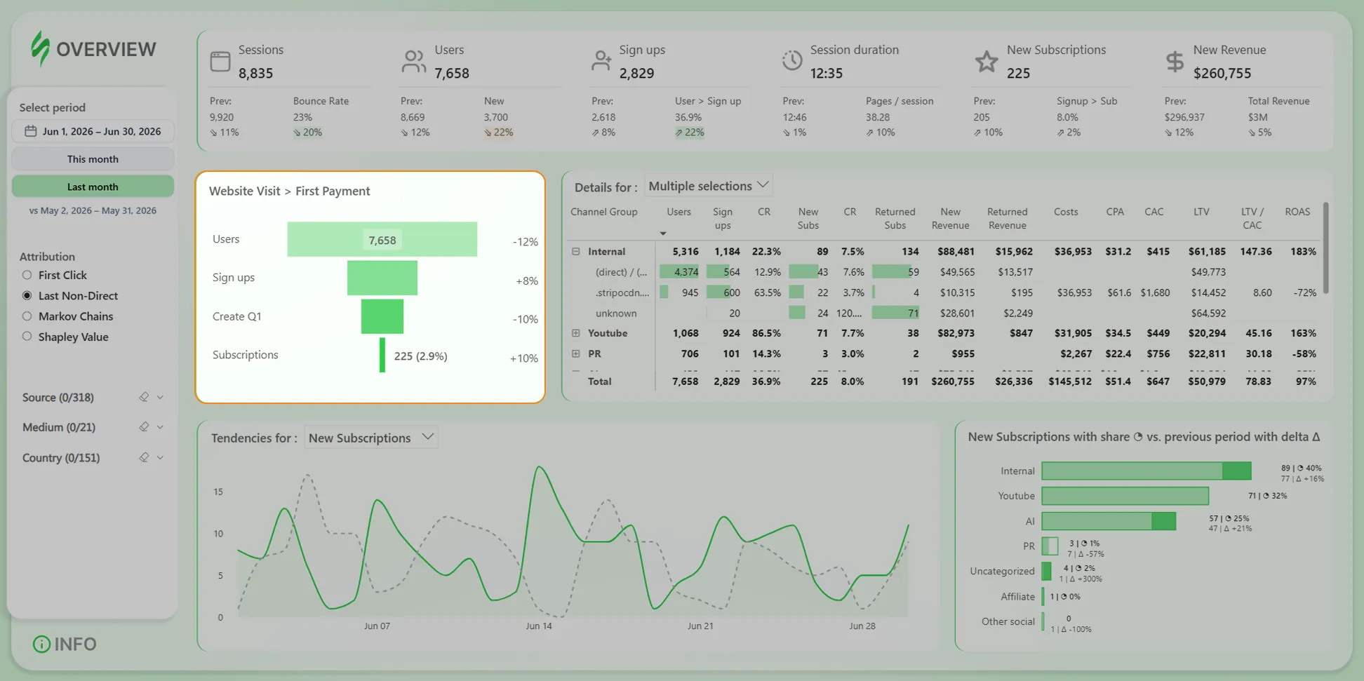
Focus on acquisition and new revenue. The report's key metrics are new subscriptions and new revenue; revenue from customers who returned after canceling their subscription is counted separately. This directly answers the main question: which channels bring in not just sign-ups, but paying customers.
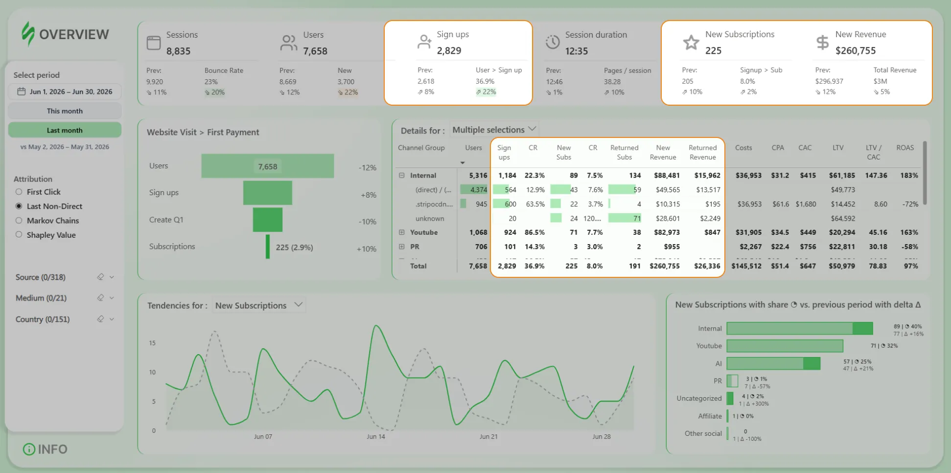
Channel economics. Broken down by channel: acquisition cost (CAC and CPA), return on ad spend (ROAS), projected customer lifetime value (LTV), and the LTV/CAC ratio. Both advertising and non-advertising costs are factored in, so the return figures reflect the full picture rather than half of it.
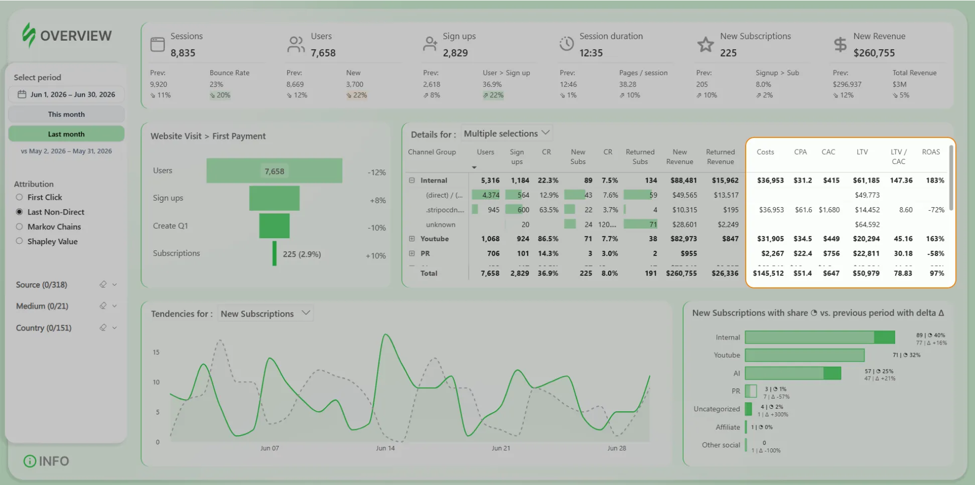
Period comparison. Every key metric sits next to its value from the previous period, and color coding highlights significant changes, so deviations are visible at a glance, without having to pore over tables.
This report uses our own custom date filter, which allows quick selection of preset periods and flexible control over how the previous comparison period is displayed.
Attribution model switcher. With a single click, the metrics are recalculated using First Click, Last Non-Direct, Shapley, or Markov. The marketer looks at a channel through the eyes of "last click," and then through the eyes of a data-driven model, and sees whether the channel's value holds up or is an illusion created by a single methodology. This is exactly why we built four models instead of one.
Filters by source, channel, and country let you drill down from the overall picture to a specific segment.
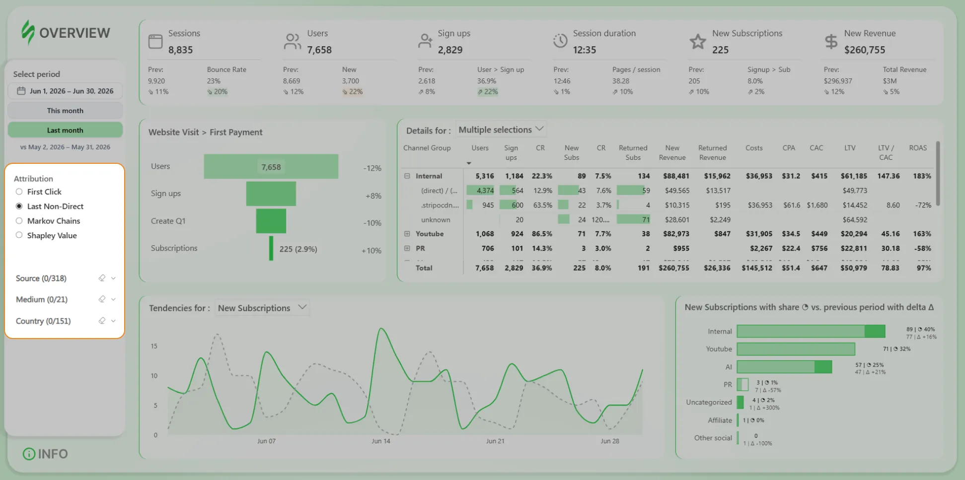
This is a powerful tool — but like any dashboard, it only answers the questions that were built into it in advance. And real business questions don't always fit into predefined breakdowns. This is precisely where the AI assistant becomes the logical next step.
The AI Assistant on Top of the Data
The final layer of the system is an assistant built on Claude, connected to that same BigQuery warehouse. We didn't just give it access to the data — we also equipped it with the kind of context an in-house analyst accumulates over years:
- precise metric definitions — exactly how MRR, revenue, churn, conversions, CAC, LTV, ROAS, and attribution are calculated;
- data pitfalls — where duplication easily occurs, which dates to use for revenue versus churn, how revenue differs from MRR, and when an analysis should be cohort-based rather than month-by-month;
- a working method — first clarify the intent and formulate a hypothesis, then calculate, check itself against a checklist of common mistakes, break the result down into its causes, and propose next steps.
In other words, the assistant received not just the data, but a way to read it correctly.
The report shows predefined breakdowns. The assistant works where a question arises for the first time and no ready-made breakdown exists for it. For example:
- "which campaigns bring in organizations that later upgrade to a higher plan, rather than just registering";
- "compare the value of customers from organic versus paid advertising over the first six months of the relationship";
- "which countries generate the most revenue from returning customers this quarter."
The assistant computes every such answer directly from the tables, without the team writing a single line of SQL. Follow-up questions are asked in the same conversation — "now break this down by month" — and the picture gets refined step by step.
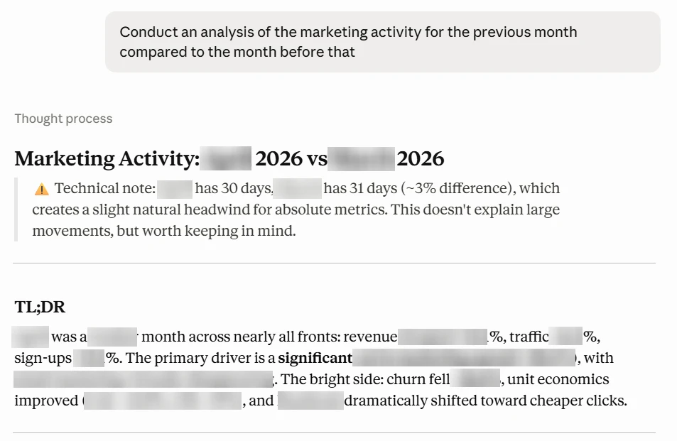
The assistant doesn't just pull numbers — it works with them: ranking, segmenting, comparing periods, looking for patterns, assessing risk. So its use isn't limited to reference queries — how far it can go is shown in the next section.
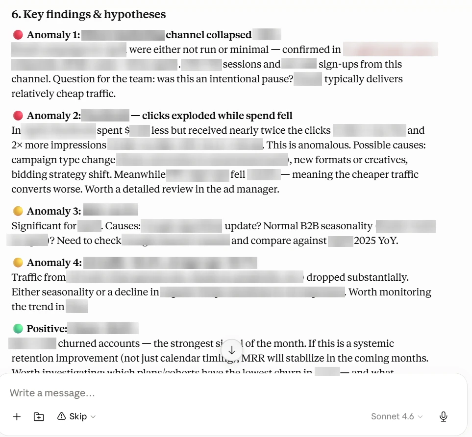
At the same time, the assistant calculates using the same definitions built into the report, so its answers match the figures in Power BI and can be verified: on request, it shows which data and which logic produced the result. This is the key difference from a chatbot simply connected to raw, unprocessed tables: such a chatbot would have to guess the business context itself and figure out how to correctly combine dozens of unfamiliar fields — and it's exactly this kind of guessing that produces plausible but wrong answers. Our assistant works on data that is already structured, with agreed-upon definitions, so it doesn't need to guess — its answers rest on fact, not assumption.
The assistant doesn't replace the report or the analyst — they work as a pair. Often the hardest part is coming up with what to ask: the user is faced with an empty chat input field. This is where the report helps: the marketer opens it, sets a period, looks at the key metrics — and deeper questions arise from there (why did this channel dip, where should the budget be reallocated). The report shows where something is happening; the assistant shows why and what to do about it. Routine metrics stay in the report, the analyst takes on the harder work, and the circle of people who can arrive at an answer on their own grows wider.
Stress Test: Churn Prediction
We gave the assistant a deliberately difficult task — to predict which active customers were most likely to churn next month.
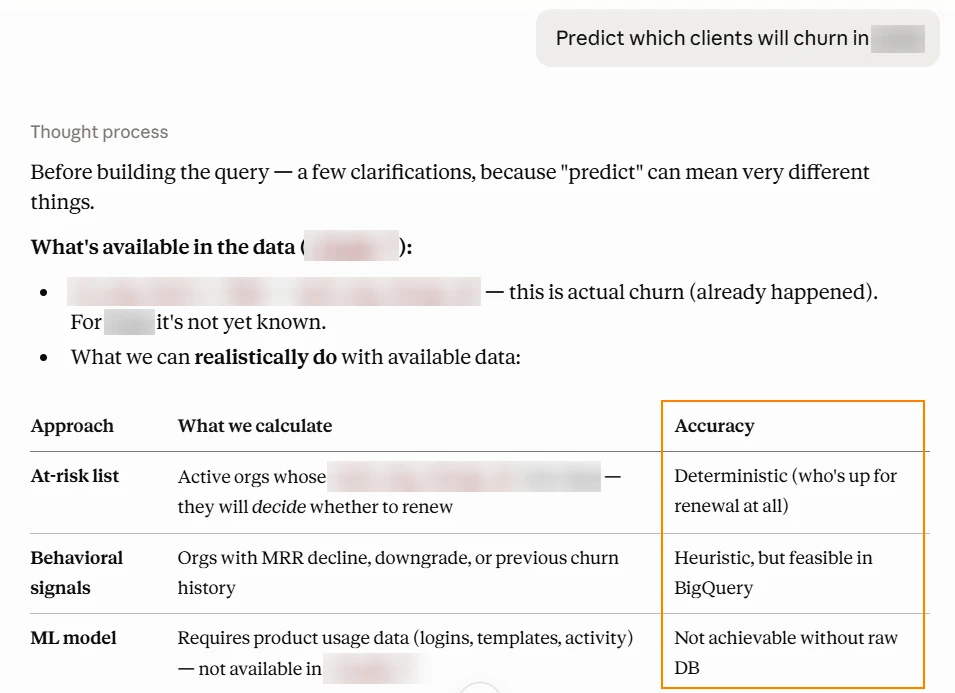
The assistant worked only with financial data — subscription, payment, and revenue history. There was no behavioral product-usage data (login frequency, editor activity) in the warehouse, since our focus was marketing analytics. Tellingly, the assistant flagged from the outset, on its own, that without product metrics the forecast would be weak. The task was deliberately set on limited data — precisely to see what the tool would deliver in a typical situation, not an ideal one.
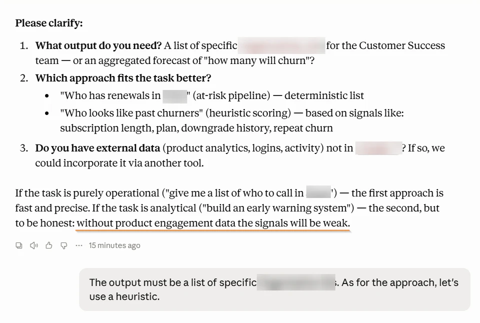
For this task we reused the data model we had already built and did not implement machine learning — everything fit into the two messages to the assistant shown in the screenshots above. The idea was to test what the tool delivers "out of the box," without a separate machine-learning project.
The assistant narrowed the pool on its own to organizations that had a payment due the following month, and evaluated each one against a set of financial signals: a recent downgrade to a cheaper plan, a decline in revenue over recent months, having returned after a previous cancellation, a short relationship duration, monthly billing instead of annual, and so on.
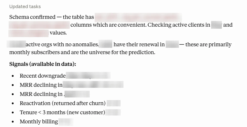
Based on the combination of these signals, it assigned each organization a risk level and produced a prioritized list for the Customer Success team.
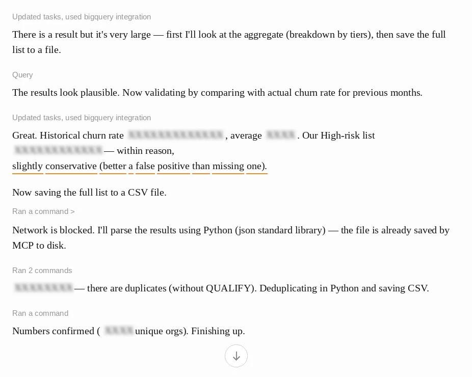
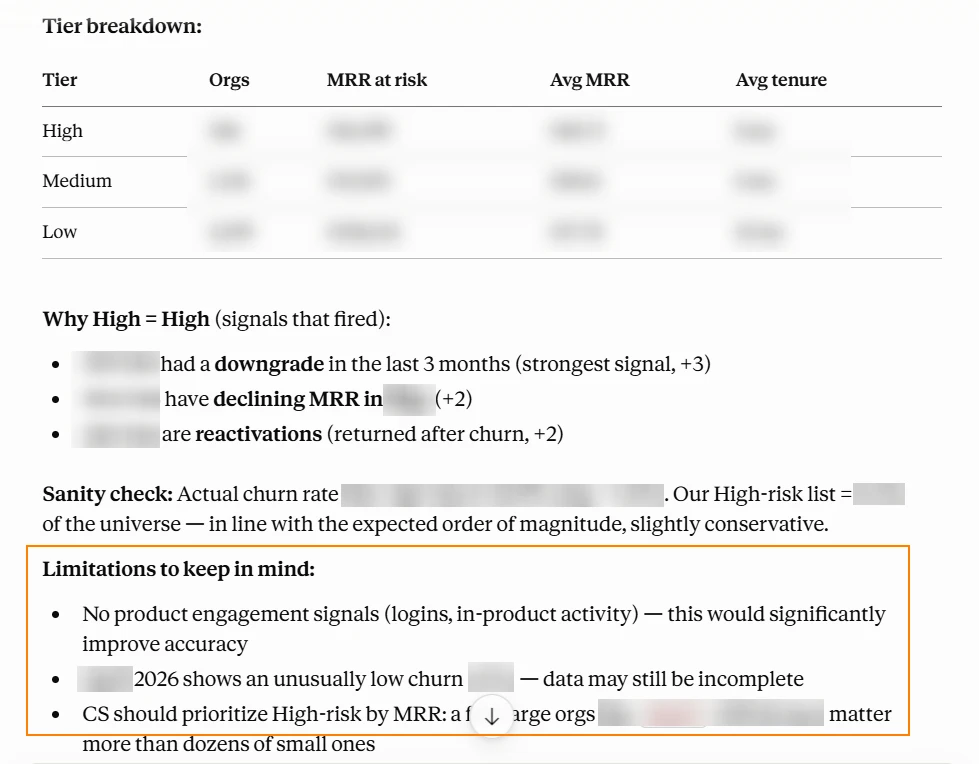
This wasn't a "paper" exercise: we saved the forecast and, a month later, checked it against what actually happened.
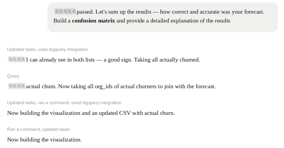
The result is genuinely mixed, which was expected. The assistant had flagged, in advance, roughly half of all the customers who actually churned. That said, the list wasn't perfect: about one in five customers on it actually churned — noticeably more often than if customers were picked at random, but that also means quite a few false alarms.
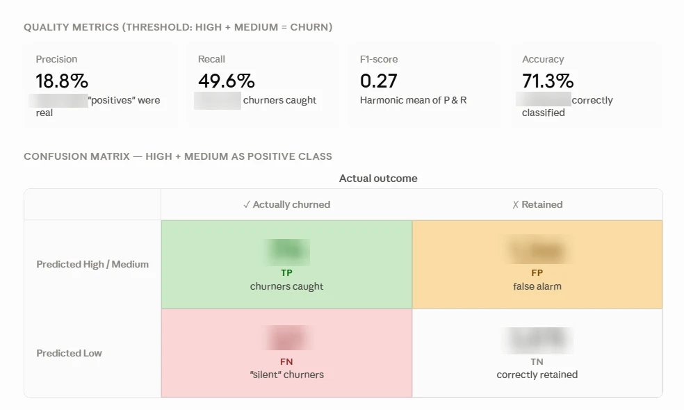
Formally, overall accuracy came out to around 71%, but for a rare event like churn, "accuracy" on its own is misleading: a model that simply says "no one will leave" would also score high on accuracy. The more meaningful benchmarks here are two rates: how many of those who actually churned the assistant caught in advance, and how many of those on the risk list turned out to be genuine. Our goal wasn't to build a production-grade model following every data science convention. We set out to demonstrate what the tool can do with the client's data in a matter of minutes.
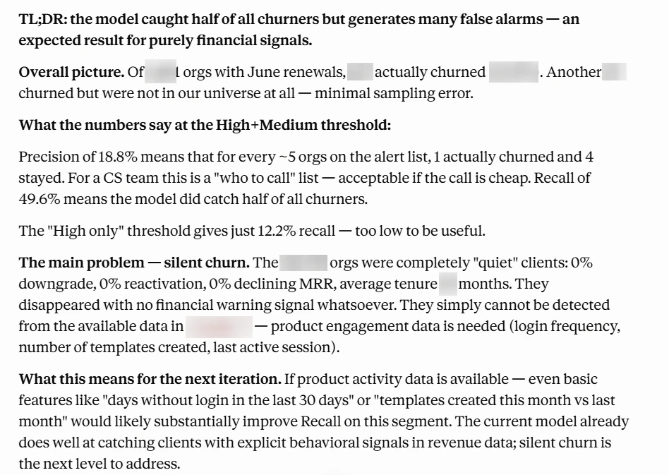
Why this matters for the business. Retaining a customer showing signs of churn is almost always cheaper than acquiring a new one to replace them. But to intervene in time, you need to know who to reach out to — before they leave, not after. That's exactly what the forecast provides: in minutes, the team gets a ranked list of organizations worth engaging with this month, while their billing cycle is still open. Catching half of those who genuinely churned ahead of time is a chance to preserve revenue, rather than seeing the loss show up in the report after the fact.
The data model built for end-to-end analytics turned out to be useful NOT only for building the report. The same foundation that delivers daily answers about channels and budget also enables proactive scenarios — like this churn forecast. A single, well-organized database pays for itself many times over, and churn is just one example of what becomes possible once the data is ready. And this is a starting point, not a ceiling: adding behavioral data could noticeably improve the accuracy of this kind of forecast.
Results
Having begun in 2025, our collaboration continues: the team uses the report every day, and we regularly take on new analytical tasks and support the project. Today, Stripo has a cohesive system in which each layer builds on the one before it:
- a single warehouse, where advertising systems and on-site behavior are connected to real revenue from the product database;
- four-model attribution that weighs each channel by its actual contribution, not just its last click;
- a Power BI report with an acquisition funnel (visit → first payment) and channel economics — CAC, CPA, ROAS, LTV, new and recovered revenue;
- AI assistant that answers non-standard questions in plain language, using verifiable definitions — up to and including proactive scenarios like churn prediction.
But what matters most isn't the list of components in this system — it's how the team's day-to-day work has changed. The client testimonial that follows tells that part of the story in more detail.


 Verified review
They are extremely helpful and quick to understand our needs and goals and build a partnership, not a transactional experience.